This article is contributed. See the original author and article here.
The Microsoft 365 PnP Team would love to invite you to the Watch Party that we are hosting for the Learn Together: Building apps with Microsoft Graph event.
The event is a 2 hour live stream and is offered live twice to accommodate the global audience:
April 14, 2021 8:30 am PDT 10:30 am PDT (North America & Europe Regions)
For the North America & Europe Regions live stream, we will host a Teams meeting to connect and collaborate while we are watching the live stream on our own devices. There will be games, popcorn, G-raphs ? and much more.
My dear Sharing Is Caring friend David Warner made a short video to explain it in his own words!
This article is contributed. See the original author and article here.
Why?
Ever since I saw the postSource code files for Canvas appsfrom Microsoft, I thought this might come in handy for some of my Canvas Apps. As a non-coding Citizen Developer, I just thought that day would be more in the future. A day when this feature would not be experimental anymore but general available :beaming_face_with_smiling_eyes:.
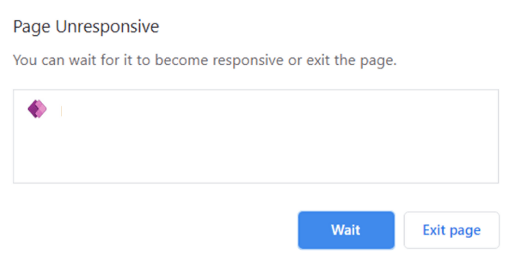
One of my customers created a Power App with too many screens, too many data sources and too many controls referencing each other. The result was a Power Apps Studio with aPage Unresponsiveerror when when opening specific screens:
This left us with no way to clean up the latest version of the Canvas App through the Studio anymore :cross_mark::face_without_mouth::cross_mark:.
What?
This post adds information on how to edit Power Apps source code for Canvas Apps. It will also show you that GitHub it is not per se needed.
How?
I still recommend to read the Microsoft post first. There is a lot of potential in using GitHub as your code repository. There are also some Youtube video’s on how to perform most of the steps explained in further detail. This post just focuses on how to use the toolingwithout a GitHub setup.
1) First step is to download the .msapp file of your Canvas App. The .msapp file is like a bundled package of multiple kind of files (.json, .xml and .yaml), making up your whole Power App :woman_technologist:.
You can download your .msapp file by opening the Power App in the online Studio. Then selecteSave asand selectThis computeras your destination. A popup should appear that offers you to download the .msapp file: Save your .msapp file to a local destination
Another option is to Export the whole Power App package from the Power Apps as a ZIP file.
Export your Power App as a packaged ZIP file
In this option you need to unzip the downloaded file and find the .msapp files in a sub folder.
2) I then move the .msapp file to a folder within my Downloads folder making the file path:
3) Make sure that you install the required .NET Core SDK version as mentioned in the Microsoft post. Then download the Power Apps Language Tooling locally to your Downloads folder:
Download the Power Apps Language Tooling tool from GitHub locally
Unzip this file and save the unzipped folder in a local place of your computer. I chose to store it next to my .msapp file so the directories would be near each other:
Please note that your directory path may be different at the beginning, but from the last PowerApps-Langauage-Tooling-master section it should be the same. The PASopa file is where the magic happens.
5) Now open the default Windows Command Prompt and Run as adminisrator:
Run Command Prompt as administrator
6) Have a folder prepared where you want to store the unpacked .msapp files. I chose a folder next to the .msapp file again:
Note that the first directory is that of the .msapp file. The second directory is that of the folder where we want to unpack the separate files. Warnings may occur because of checksums built in by the developers. However in the end, the folder with the unpacked .msapp file will have a default content structure:
With a tool like Notepad++ or my personal favorite Visual Studio Code, you can edit the individual files. This is how you edit Power Apps source code of Canvas Apps. I prefer Visual Studio Code because you can open up a whole folder in one go:
Visual Studio Code opening a whole Folder and Sub Folders to edit individual files
9) Now you can remove frozen screens, rename controls in bulk, update variables in bulk or any other action which in Power Apps Studio would be a hassle.
When this is all done, you can just repack the files with a command like:
If you are more observant than I was, you will have noticed that this command does not give an output directory… so where did the new repacked .msapp file go?? It gives you the new .msapp file in the PASopa directory:
The repacked ZIP file can be imported in the online Studio. This import will then update the existing Power App to a new version. Never thought I would say this as if I know how to develop code but –> happy coding :flexed_biceps::nerd_face::thumbs_up:!
This article is contributed. See the original author and article here.
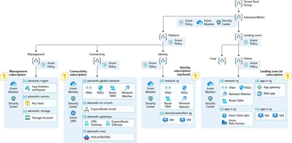
If you are starting with your cloud journey, there are many things you need to think of to set up your cloud environment and your Azure cloud architecture . Things like networking, subscription management, security, governance, and many more, can be fairly complex. That is where the Cloud Adoption Framework for Azure can deliver proven guidance to help you with your Azure cloud journey. And with Enterprise-scale landing zones, you even get an architectural approach and a reference implementation that enables effective construction and operationalization of landing zones on Azure, at scale. I had the chance to collaborate with Sarah Lean (Azure Cloud Advocate) on an enterprise-scale series of blog posts to show how our fictional company Tailwind Traders can leverage the Cloud Adoption Framework and Azure Landing Zones to accelerate their cloud journey.
You can find our Enterprise-Scale landing zones blog series on the Azure.com blog:
Microsoft Azure Cloud Adoption Framework Enterprise-Scale
The Microsoft Cloud Adoption Framework for Azure is proven guidance that’s designed to help you create and implement the business and technology strategies necessary for your organization to succeed in the cloud. It provides best practices, documentation, and tools that cloud architects, IT professionals, and business decision makers need to successfully achieve short-term and long-term objectives. By using the Microsoft Cloud Adoption Framework for Azure best practices, organizations can better align their business and technical strategies to ensure success.
Next to our Enterprise-Scale landing zones blog series, we will also host a livestream on April 7.
We will be exploring Tailwind Traders and their cloud adoption journey using enterprise-scale architecture in future blog posts. However, if you’d like to learn more about enterprise-scale landing zones then please join Sarah Lean and Thomas Maurer on the 7th April at 8am PST/3pm GMT on LearnTV where we will be doing a Q&A and deployment of an Enterprise-Scale Landing Zone live!
This article is contributed. See the original author and article here.
Issue: Unable to configure and use On-Premise data gateway when user is having personal account (*.gmail.com/*.yahoo.com etc) or work/school account belongs to multiple tenants by design.
Workaround: We can follow the below steps to install, configure and create on-premise data gateway on on-premise as well as on Azure with below steps.
Creating user in Azure AD tenant:
Create new user in the destined Azure Active directory. You can refer this doc CreateNewUser .
Provide contributor access at subscription or Resource Group (where you want to create the Azure data gateway) level
Sign-out from the portal and sign-in with new user created above . It will ask you to change password, update the password and check if you are able to login to portal.
Install and Configure On-Premise data gateway on On-Premise machine:
Now, you can download and install the on-premise data gateway on your On-Premise machine. You can refer to the link for downloading and installing gateway logic-apps-gateway-install .
Once the gateway is successfully installed, it pops up for the sign-in to configure the gateway.
Use the new user created in the Azure Active directory to sign-in and configure gateway. Follow the steps mentioned n above link. install-data-gateway
Verify Gateway Cluster in Power Platform center:
You can verify whether the gateway clustered configured is available in the power platform portal (log in with new Azure AD user) Manage DataGateways.
You need to select region in which you configured gateway in portal, option is available on the top right side.
Creating On-Premise data gateway in Azure:
Sign-in to azure portal with new Azure AD user used to configure the data gateway on on-premise machine
Create new Azure On-Premise data gateway resource in respective resource group where user has access. you can follow this doc on how to create azure On-premise data gateway resource. Create-azure-gateway-resource
Note:
This can be an extra effort for managing the new user we created in Azure AD tenant.
This article is contributed. See the original author and article here.
The 10th cumulative update release for SQL Server 2019 RTM is now available for download at the Microsoft Downloads site. Please note that registration is no longer required to download Cumulative updates. To learn more about the release or servicing model, please visit:
Starting with SQL Server 2017, we adopted a new modern servicing model. Please refer to our blog for more details on Modern Servicing Model for SQL Server
This article is contributed. See the original author and article here.
About #EarthDay
Did you know that April 22 is Earth Day? In 2020, over 100 million people worldwide celebrated the 50th anniversary of Earth Day, driving awareness and actionable learning around environmental issues with activities focused on education, conservation, citizen science, cleanup and more.
In 2021, the #EarthDay theme is Restore Our Earth with a focus on five topics:
The Canopy Project – a conservation and restoration effort to plant trees and rehabilitate areas in need of reforestation.
Global Earth Challenge – a citizen science initiative to engage millions of people in collecting and understanding environmental data.
Sustainability is an area of significant importance to Microsoft and we wanted to do something to help create awareness and empower actionable learning around relevant topics for technologists.
Awareness: #GreenTech Advocacy
In a January 2020 announcement, Microsoft laid out ambitious company-level goals for sustainability including: being carbon negative by 2030, removing historical carbon emissions by 2050, and establishing a $1B climate innovation fund to invest in research in context. One year later, the Environmental Sustainability Report (read the three-part blog coverage) reviewed progress, focusing on four pillars:
Be carbon negative – remove more carbon dioxide than we emit each year.
Be water positive – put more water back into the environment than we consume.
Be zero waste — encourage redesign of resource lifecycles to eliminate or reduce waste.
Support healthy ecosystems – collect and analyze data to understand ecosystems, stop decline.
This is progress at organization scale. But you might be asking yourself — “how can I educate myself on the issues and contribute to, or advocate for, sustainable living and engineering practices in my community and workplace?” We’re glad you asked!
Here are a few resources to get you started on your learning journey:
GreenTech blog – read articles on best practices and insights from experts and practitioners.
Awareness is great but actionable learning is better! So we came up with a fun challenge for April, just in time for #EarthDay!
Action: #VisualGreenTech Challenge
Here is how this works:
What we do: Share a learning prompt (pinned daily under @nitya) with a resource link to help you explore that topic.
What you do: Check out the resource and respond to the prompt using a visual (sketchnote or doodle) with insights.
Share the visual on Twitter and tag it #EarthDay #VisualGreenTech
We’ll collate all submissions and feature them in a segment on the #HelloWorldLive show on EarthDay (Apr 22)
Submit responses to as many prompts as you like, as many times as you want to. The goal is to create awareness around those topics and share our own learnings and perspectives in context. Want a sneak peek at the prompts in advance?check out the gallery here.
But wait. There’s one more thing!
Share a Sketch. Plant A Tree!
Along with featuring all submitted visual Earth Day images, we will also work with Ecosia to plant 1,000 trees in honor of all #VisualGreenTech challenge participants to help tackle climate change. Yes, that’s right! Let’s give back to the earth and learn more about sustainability in the process.
Have questions? Leave us a comment on this post!And let’s make a difference to this planet.
This article is contributed. See the original author and article here.
Azure Static Web Apps seamlessly integrates globally distributed hosting for your static content, serverless APIs powered by Azure Functions, as well as features like authentication, custom routing, and route-based authorization.
With the new Static Web Apps CLI, you can now run your entire full-stack web app locally in your development environment and access many of the platform’s capabilities without deploying your app. The CLI hosts your frontend and API on a single localhost endpoint and emulates authentication, custom routing, and authorization rules.
Static Web Apps CLI can serve static content from a folder. It also works great with local development servers from any frontend framework, including React, Angular, Next.js, and Blazor WebAssembly.
Getting started
Install the Static Web Apps CLI from npm:
npm install -g @azure/static-web-apps-cli
To serve static content from a folder, run:
swa start ./my-app
Your app is accessible at http://localhost:4280. If you have any custom route logic or settings configured in a staticwebapp.config.json file, it’ll apply them automatically.
Run and test your full-stack app
Use a framework dev server
Most frontend frameworks provide a local dev server that allows you to iterate on your app quickly using features such as hot module reloading. Static Web Apps CLI can proxy traffic to a dev server that’s already running.
How you start your app’s dev server depends on your framework. Here are some examples:
# Create React App
npm start
# Next.js
npm run dev
# Blazor WebAssembly
dotnet watch run
Then, in a separate terminal, start the CLI and provide your framework dev server’s local address:
swa start http://localhost:3000
Requests to http://localhost:4280 are proxied to your dev server. Using that endpoint, you can test out how your app interacts with Static Web Apps features like authentication and API functions.
Simulate authentication
Azure Static Web Apps provides integrated authentication using providers such as GitHub, Twitter, and Azure Active Directory. The Static Web Apps CLI simulates the same authentication flow so you can test your authentication/authorization logic locally.
When your app requests a Static Web Apps authentication login URI, such as /.auth/login/github, the CLI displays a page that allows you to log in as any identity by specifying their information. This works with all supported identity providers without any additional configuration.
Static Web Apps CLI local authentication page
You can use this to easily test your app using different identities and roles. The /.auth/me endpoint returns information about the current user, and API function calls include a claims principal header—they work just like they do when your app is deployed to Azure! Learn more about how to access user information from our documentation.
Run API functions
If your app has an Azure Functions API, you can include its location when you start the Static Web Apps CLI:
swa start http://localhost:5000 –api ./api
Behind the scenes, as the CLI launches, it also starts the API app using the Azure Functions Core Tools. You can access your API functions at http://localhost:4280/api/*. Because the frontend app and serverless functions are served from the same origin, you don’t have to worry about CORS (cross-origin resource sharing) when you call your APIs.
What’s next?
Static Web Apps CLI is currently in preview. We’re only getting started and have lots more planned!
Together with the Azure Static Web Apps VS Code extension, the CLI will play an important role in our local development experience. We plan on offering an integrated debugging experience in VS Code that lets you start your entire stack and attach debuggers to both your frontend and backend apps.
While we are initially focusing on running apps locally, we plan on expanding the CLI with more commands such as creating Static Web Apps projects.
This article is contributed. See the original author and article here.
I love Microsoft Teams and I also love controlling my online appearance, but sadly both aren’t big friends when you are a Guest in another tenant. There still isn’t a good/easy way of controlling your own profile picture, which is sad because you are reduced to a not-very-personal coloured circle with initials:
Fellow MVP Kazushi Kamegawa shared a method of changing your profile picture in a private forum, but it stopped working due to some UI changes in the Azure Portal. Luckily, with some more “hackery”, we can still make it work!
The tldr version:
Tenant switch to the tenant where you want to change your profile picture
Figure out the ID of your user account in that tenant
Open your user profile page in the Azure Portal using a direct link
Edit the profile, upload a profile picture
Wait for about a week to have the profile picture synced into Teams
Switch tenants
If you found this blogpost, it’s probably safe to assume that you know how to switch tenants. For the purpose of this guide, it is VERY important you do this in your browser because otherwise authentication will get confused ;).
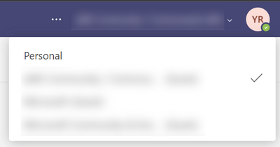
Top right of the Teams UI, switch to the tenant where you want to change the profile picture of your Guest account
Get ID of user account
I don’t know of any place in the UI that shows the id of your Guest account in a tenant, so I had to find a way using the Developer Tools of Chrome/Edge.
After switching to the Guest tenant, hit the F12 key to open the Developer Tools
In the right part, do a search for ts.tenantList. It should only show one result, select it.
It shows all tenants you are part of as a Guest, open up the one you are currently in. You’ll need the value next to the userId property. In my screenshot, it is the GUID that starts with f35707ec-…
User profile page in Azure Portal
Now that you have your user account ID, you can open up your profile page in the Azure AD of the Guest tenant!
Top right of the portal, make sure you are in the tenant where you are a Guest. Most probably that is not the case, so do a tenant switch in the Azure Portal too.
You should now see your profile page in the Azure AD where you are a Guest.
Edit profile and upload picture
Finally time to upload your profile picture!
Top of the profile, click the Edit button
With your profile in edit mode, you can browse for a photo on your computer and upload it to your profile!
Wait and enjoy success
It takes a while for your profile picture to show in Teams, and it might even show for a short while and go away again. But if you have enough patience, after about a week or so, your profile picture should show consistently across the Teams UI both for you and for others!
Until Microsoft Teams or Microsoft 365 gives us an easier way to change our profile picture, this is the best way to do it self service. The days of the anonymous circle with initials are over, time to show your personality also in your Guest tenants!
This article is contributed. See the original author and article here.
Ever get annoyed with the page properties web part put out by Microsoft? If you’ve got some OCD issues (like me) then it may not take very long. At ThreeWill, we help clients with their digital workplaces and improving the way their users can obtain information and makes sense of it all. Oftentimes, the Page Properties web part can be useful here, as we very often add valuable metadata to pages in a digital workplace, which we often tie to page templates as well. News might roll up based on these page properties, which can assist in finding information in many ways. But its often handy to display this metadata in a clean way on a page as well. The standard Page Properties web part seeks to do just that. And, for the most part, it does a fine job with it. But it has a few deficiencies. The most annoying thing to me, when setting up digital workplaces was that it only supports a white background. But there are other small things, like the limitations with pretty standard field types. I like the idea of taking advantage of metadata columns for pages, but being able to use it visually is equally important. I finally decided to do something about it and build a new version of this web part. So with this in mind, let’s lay out our goals with this new web part. We will call it the Advanced Page Properties web part. Feature Goals Attempt to replicate the functionality of Page Properties with the following improvements:
Support for theme variants Updated to standard capsule look for list options Support for image fields Support for hyperlink fields Support for currency Improved support for dates In other words, we’re shooting for this:
Property Pane For a part like this, it’s all about getting the property page figured out first. We want this to feel familiar too and not stray too much from the original design, unless it helps. Let’s start by recognizing our chief property that the web part needs: selectedProperties. This array will hold the internal names of the fields that a user has selected for display in our web part. We intend on passing this property down to our React component. Here’s a look at our property object: export interface IAdvancedPagePropertiesWebPartProps { title: string; selectedProperties: string[]; } In our AdvancedPagePropertiesWebPart, we want to hold all possible properties for drop downs in a single array. private availableProperties: IPropertyPaneDropdownOption[] = []; Next, we need the following method to obtain the right types of properties for display: private async getPageProperties(): Promise<VOID> { Log.Write(“Getting Site Page fields…”); const list = sp.web.lists.getByTitle(“Site Pages”); const fi = await list.fields();
this.availableProperties = []; Log.Write(`${fi.length.toString()} fields retrieved!`); fi.forEach((f) => { if (!f.FromBaseType && !f.Hidden && !f.Sealed && f.SchemaXml.indexOf(“ShowInListSettings=”FALSE””) === -1 && f.TypeAsString !== “Boolean” && f.TypeAsString !== “Note” && f.TypeAsString !== “User”) { this.availableProperties.push({ key: f.InternalName, text: f.Title }); Log.Write(f.TypeAsString); } }); } We are using the PnP JS library for gathering the fields in the Site Pages library. Figuring out the right types of filters to gather was a bit of trial-and-error. We are excluding anything that’s inherited from a base type or is hidden in any way. We are also excluding 3 standard types so far: boolean, note and user. Note doesn’t make sense to display. Boolean can definitely work, but needs a good display convention. User was the only tricky object, which is the reason it isn’t done yet. We call the above method prior to loading up the property pane. protected async onPropertyPaneConfigurationStart(): Promise<VOID> { Log.Write(`onPropertyPaneConfigurationStart`); await this.getPageProperties(); this.context.propertyPane.refresh(); } We need handlers for adding and deleting a property and selecting a property from a dropdown. These methods make necessary changes to the selectedProperties array. protected onAddButtonClick (value: any) { this.properties.selectedProperties.push(this.availableProperties[0].key.toString()); }
protected onPropertyPaneFieldChanged(propertyPath: string, oldValue: any, newValue: any): void { if (propertyPath.indexOf(“selectedProperty”) >= 0) { Log.Write(‘Selected Property identified’); let index: number = _.toInteger(propertyPath.replace(“selectedProperty”, “”)); this.properties.selectedProperties[index] = newValue; } } Finally, with all of our pieces in place, we can render our property pane with all it’s needed functionality. protected getPropertyPaneConfiguration(): IPropertyPaneConfiguration { Log.Write(`getPropertyPaneConfiguration`);
// Initialize with the Title entry var propDrops: IPropertyPaneField<ANY>[] = []; propDrops.push(PropertyPaneTextField(‘title’, { label: strings.TitleFieldLabel })); propDrops.push(PropertyPaneHorizontalRule()); // Determine how many page property dropdowns we currently have this.properties.selectedProperties.forEach((prop, index) => { propDrops.push(PropertyPaneDropdown(`selectedProperty${index.toString()}`, { label: strings.SelectedPropertiesFieldLabel, options: this.availableProperties, selectedKey: prop, })); // Every drop down gets its own delete button propDrops.push(PropertyPaneButton(`deleteButton${index.toString()}`, { text: strings.PropPaneDeleteButtonText, buttonType: PropertyPaneButtonType.Command, icon: “RecycleBin”, onClick: this.onDeleteButtonClick.bind(this, index) })); propDrops.push(PropertyPaneHorizontalRule()); }); // Always have the Add button propDrops.push(PropertyPaneButton(‘addButton’, { text: strings.PropPaneAddButtonText, buttonType: PropertyPaneButtonType.Command, icon: “CirclePlus”, onClick: this.onAddButtonClick.bind(this) }));
return { pages: [ { header: { description: strings.PropertyPaneDescription }, groups: [ { groupName: strings.SelectionGroupName, groupFields: propDrops } ] } ] }; } Our Component and Displaying our fields/values Our React component needs to properly react to the list of selected properties changing. It also needs to react to our theme changing. I leveraged this awesome post from Hugo Bernier for the theming, so I will not cover that in-depth, although you will see how it’s being leveraged in the code snippets below. Here are the properties we plan to start with and respond to: export interface IAdvancedPagePropertiesProps { context: WebPartContext; title: string; selectedProperties: string[]; themeVariant: IReadonlyTheme | undefined; } We will track the state of our selected properties and their values with hooks. We want to trigger off of changes to our properties, so we will setup a reference to their current state. We will also establish our themeVariant and context at the start of our component. // Main state object for the life of this component – pagePropValues const [pagePropValues, setPagePropValues] = useState<PAGEPROPERTY>([]); const propsRef = useRef(props);
sp.setup({ spfxContext: props.context }); So we are tracking the state of pagePropValues, which is an array of type PageProperty. What is PageProperty? import { IFieldInfo } from “@pnp/sp/fields”;
export interface PageProperty { info: IFieldInfo; values: any[]; } Our effect is looking to see when changes are made to the properties, then is peforming our core logic to refresh properties and values. /** * @description Effects to fire whenever the properties change */ useEffect(() => { refreshProperties();
return () => { // No cleanup at this moment }; }, [propsRef.current]); The core method is refreshProperties. It has 2 main calls it needs to make, whenever selected properties has changed: Establish any known metadata for each property that will assist in display and obtain all actual values for this property and the specific page id that we are viewing. /** * refreshProperties * @description Gets the actual values for any selected properties, along with critical field metadata and ultimately re-sets the pagePropValues state */ async function refreshProperties () { var newSetOfValues: PageProperty[] = [];
// Get the value(s) for the field from the list item itself var allValues: any = {}; if (props.context.pageContext.listItem !== undefined && props.context.pageContext.listItem !== null) { allValues = await sp.web.lists.getByTitle(“Site Pages”).items.getById(props.context.pageContext.listItem.id).select(…props.selectedProperties).get(); console.log(allValues); }
for (let i = 0; i < props.selectedProperties.length; i++) { const prop = props.selectedProperties[i];
Log.Write(`Selected Property: ${prop}`);
// Get field information, in case anything is needed in conjunction with value types const field = await sp.web.lists.getByTitle(“Site Pages”).fields.getByInternalNameOrTitle(prop)();
// Establish the values array var values: any[] = []; if (allValues.hasOwnProperty(prop)) { switch (field.TypeAsString) { case “TaxonomyFieldTypeMulti”: case “MultiChoice”: values = _.clone(allValues[prop]); break; case “Thumbnail”: values.push(JSON.parse(allValues[prop])); break;
default: // Default behavior is to treat it like a string values.push(allValues[prop]); break; } }
// Push the final setup of a PageProperty object newSetOfValues.push({ info: field, values: […values] }); }
setPagePropValues({…newSetOfValues}); } } As we loop through all of the properties that have been selected, we make calls with PnP JS to get all of the metadata per field and all of the values per field. The call to get all of the values can return with any number of data types, so we need to be prepared for that. This is why it is of type any[] to start. But this is also why we have a switch statement for certain outlier situations, where the line to set the array of any need to be done a little differently than the default. Our 3 known cases of needing to do something different are TaxonomyFieldTypeMulti, MultiChoice and Thumbnail. React and Display Our function component returns the following: return ( <DIV classname=”{`${styles.advancedPageProperties}”> {RenderTitle()} {RenderPageProperties()} </DIV> ); RenderTitle is pretty straightforward. /** * RenderTitle * @description Focuses on the 1 row layer, being the Title that has been chosen for the page * @returns */ const RenderTitle = () => { if (props.title !== ”) { return <DIV classname=”{styles.title}”>{props.title}</DIV>; } else { return null; } }; RenderPageProperties is the first of a 2-dimensional loop, where we want to display a section for each page property that was select, just like the original. ** * RenderPageProperties * @description Focuses on the 2nd row layer, which is the property names that have been chosen to be displayed (uses Title as the display name) * @returns */ const RenderPageProperties = () => { if (pagePropValues !== undefined && pagePropValues !== null) { var retVal = _.map(pagePropValues, (prop) => { return ( <> <DIV classname=”{styles.propNameRow}”>{prop.info.Title}<SPAN style=”{{display:”> – {prop.info.TypeAsString}</SPAN></DIV> <DIV classname=”{styles.propValsRow}”> {RenderPagePropValue(prop)} </DIV>
); }); return retVal; } else { return <I>Nothing to display</I>; } }; This method then calls our final display method, RenderPagePropValue, which peforms our 2nd layer of array display, mapping all of the values and providing the correct display, based on the field type of the selected property. This is the heart of the display, where various type conversions and logic are done real-time as we display the values, including trying to achieve a slightly more modern SharePoint look using capsules for array labels. /** * RenderPagePropValue * @description Focuses on the 3rd and final row layer, which is the actual values tied to any property displayed for the page * @param prop * @returns */ const RenderPagePropValue = (prop: PageProperty) => { console.log(prop); var retVal = _.map(prop.values, (val) => { if (val !== null) { switch (prop.info.TypeAsString) { case “URL”: return ( <SPAN classname=”{styles.urlValue}”><A href=”{val.Url}” target=”_blank” style=”{{color:” semanticcolors.link=””>{val.Description}</A></SPAN> ); case “Thumbnail”: return ( <SPAN><IMG classname=”{styles.imgValue}” src=”{val.serverRelativeUrl}” /></SPAN> ); case “Number”: return ( <SPAN classname=”{styles.plainValue}”>{(prop.info[“ShowAsPercentage”] === true ? Number(val).toLocaleString(undefined,{style: ‘percent’, minimumFractionDigits:0}) : (prop.info[“CommaSeparator”] === true ? val.toLocaleString(‘en’) : val.toString()))}</SPAN> ); case “Currency”: return ( <SPAN classname=”{styles.plainValue}”>{(prop.info[“CommaSeparator”] === true ? new Intl.NumberFormat(‘en-US’, { style: ‘currency’, currency: ‘USD’ }).format(val) : Intl.NumberFormat(‘en-US’, { style: ‘currency’, currency: ‘USD’, useGrouping: false }).format(val))}</SPAN> ); case “DateTime”: //,””,, switch (prop.info[“DateFormat”]) { case “StandardUS”: return ( <SPAN classname=”{styles.plainValue}”>{new Date(val).toLocaleDateString()}</SPAN> ); case “ISO8601”: const d = new Date(val); return ( <SPAN classname=”{styles.plainValue}”>{`${d.getFullYear().toString()}-${d.getMonth()}-${d.getDate()}`}</SPAN> ); case “DayOfWeek”: return ( <SPAN classname=”{styles.plainValue}”>{new Date(val).toLocaleDateString(“en-US”, { weekday: ‘long’, month: ‘long’, day: ‘numeric’, year: ‘numeric’ })}</SPAN> ); case “MonthSpelled”: return ( <SPAN classname=”{styles.plainValue}”>{new Date(val).toLocaleDateString(“en-US”, { month: ‘long’, day: ‘numeric’, year: ‘numeric’ })}</SPAN> ); default: return ( <SPAN classname=”{styles.plainValue}”>{new Date(val).toLocaleDateString()}</SPAN> ); } case “TaxonomyFieldTypeMulti”: case “TaxonomyFieldType”: return ( <SPAN classname=”{styles.standardCapsule}” style=”{{backgroundColor:” semanticcolors.accentbuttonbackground=””>{val.Label}</SPAN> ); default: return ( <SPAN classname=”{styles.standardCapsule}” style=”{{backgroundColor:” semanticcolors.accentbuttonbackground=””>{val}</SPAN> ); } } else { return (<SPAN classname=”{styles.plainValue}”>N/A</SPAN>); } }); return retVal; }; So that’s all of the necessary code. Here’s what the finished product looks like, compared to the original page properties web part.
This web part is now officially apart of the PnP Web Parts repository and can be found here. I would love to hear about improvements you’d like to see and obviously you are more than welcome to contribute. I already have a bit of a list of things I’d love to see it do. Other ideas for improvements:
Capsules to be linkable to either a search result page or a filtered view of site pages (we always get clien requests for this) Support for People fields (this is the only thing lacking from the original) Support for Boolean fields (just need the right idea for proper display, really) Styling per property (ie. colorizing per property or something to that effect) Conclusion Hopefully, I’ve gotten you excited about Page Properties again and you’ve learned a little along the way around how the current Page Properties part might be doing what it does under the hood. Please consider contributing and feel free to reach out to me anytime. Thanks for your time! </PAGEPROPERTY></ANY></VOID></VOID>


Recent Comments