by Contributed | May 26, 2021 | Technology
This article is contributed. See the original author and article here.
I had a chance to sit down and interview the Susquehanna Township School District and Martin Schultz with HP to discuss the amazing work they did with Microsoft Teams . They were able to provide not only an engaging and forwarding thinking model for delivering classes during the pandemic, but also the groundbreaking work to make the in-school experience more engaging and personal. The one major feedback I received from our interview was that IT Pros wanted to better understand how the school district put this hybrid system of HP, Logitech, and Jabra devices, paired with Windows 10 and Microsoft Teams together.
If you have not had a chance to watch this episode yet, please check it out first: “How Susquehanna Township School District delivered world-class hybrid education solution using Teams”.
In this blog, I am excited to have the architect of the system and show guest, Martin Schultz from HP, dive deeper into this experience. Let’s walk through the process of how Susquehanna Township School District started preparing their students and teachers for hybrid learning.
Martin Schultz: When I was first introduced to the IT Director of the school district back in the middle of the pandemic in the summer of 2020. It was immediately obvious that the school district needed to architect a solution to support hybrid, synchronous learning for the fall session. The key issue was how they were going to support both in-room and at-home students with live, synchronous instruction from the teachers and ensure the remote experience was as engaging as the in-classroom experience, and they had to achieve all this without adding further complexity for the teachers, IT staff, and students.
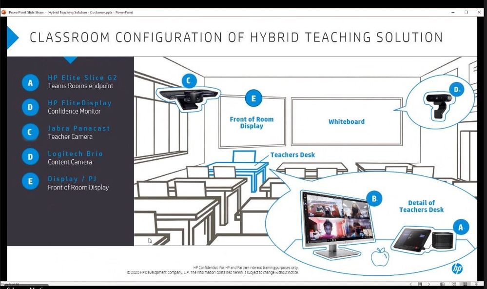
Right away, we started collaborating with the IT Director on the necessities of the core workflows: a camera fixed on the teacher wherever the teacher moved, a camera to share whiteboard content, and the ability to show lab experiments, books, and objects as teaching aids, as well as ensuring mask-wearing teachers could be clearly heard by the remote students, and ensuring the remote students could participate in class assignments and discussions by raising their hands, be assigned into breakout workgroups, and be clearly seen and heard by the in-room classmates and teacher when participating.
One key challenge was audio performance and how to make sure everyone could be heard from the classroom. They went through several design alternatives, including considering lavalier mics for the teachers, in-ceiling mic/speakers to capture full room sound, and hand-held mics to pass around the classroom. Another challenge was camera placement: should they install from the ceiling, should they use multiple cameras for different angles/perspectives, and how to cover the entire front of classroom setting where the teacher was likely to do most of their instruction from.

They began some early testing and selected the HP Elite Slice G2 with Microsoft Teams Rooms as the core endpoint device. The HP Elite Slice G2 includes a touch panel to easily start each class period and control the remote class experience, four microphones to allow the teacher to freely roam the classroom and still be heard even with a mask on, speakers to provide a 360-degree surround sound experience to hear the remote students even from the back of the classroom, and a confidence monitor for the teacher to engage and view the remote students. The HP Elite Slice G2 performed exactly as designed for the audio capabilities: there was no need for lavalier mics, expensive in-ceiling modifications, or worrying about batteries; it just worked and allowed everyone to hear the teacher, the in-room students, and the remote students!
For convenience, the HP Elite Slice G2 was placed on a cart next to the teacher’s desk and an HDMI cable was connected between the teacher’s docking station and the Slice G2 ingest port to allow for instant content sharing from the teacher’s laptop for both in-room and remote viewing and instruction. They had some early challenges as this was not a supported specification for MTR devices, but with the help of Microsoft and HP engineering, an upgrade was provided just in time before the school year started.
To make sure the school district maximized visual engagement between the teacher and the remote students, two cameras were designed into the solution. The Jabra Panacast camera was selected as it allowed the teacher to roam anywhere in front of the classroom – where they spend most of their instructional time – and the camera automatically auto-framed and auto-tracked wherever the teacher walked. This was critical as the teacher was always in focus for remote students to see, even while viewing content. The spotlight mode in the Microsoft Teams client also became generally available, which greatly enhanced the remote experience.

A second camera, a Logitech Brio content camera, was mounted next to the Jabra Panacast camera on a dual camera mount on a tripod. The Logitech Brio was selected to perform dual purposes: to share whiteboard content with the MTR enhanced mode turned on and as a secondary object camera to show lab experiments, do manipulative teaching, show objects, and even read/see pages from a book in class. The content camera provided the unique advantage of allowing in-room students to stay at their desks while the teacher shared content from the Logitech Brio, which was displayed on the projector in-class and on the screens of the remote students simultaneously – enhancing the experience for everyone. At one point, there was discussion of ceiling mounting the cameras, but it turned out that the tripod supported a third use case: the ability to swivel the Jabra Panacast camera 180 degrees and allow the remote students to see and interact with the in-room students for certain instructional sessions.
After piloting all the workflows and experiences of the system and testing with a handful of teachers, the deployment of all 240 classrooms across four buildings was scheduled two weeks before school started. The deployment took about five days, just in time to allow for a soft-launch of the first week of school for in-room students, remote students, and teachers to get accustomed to the system and start their school year.
Remote students using their laptops, tablets, and the Microsoft Teams app are now learning just as well as their in-room classmates, thus providing a choice to parents and students to learn in-class or from home. In fact, when a survey was sent out to the parents for the second semester, over 90% of the remote students preferred to continue learning using the hybrid teaching solution from home, and the solution in place will also support future learning-from-home for any reason going forward.
Since then, HP has added formal professional development services to the hybrid teaching solution to help school districts get specific teacher training on the various workflows of the system, train-the-trainer workshops, webinars, and assessment results. In addition, HP offers a 30-day trunk-kit loaners for qualified schools, which includes all the components of the hybrid learning solution, including the HP Elite Slice G2, cameras, and cabling needed to setup a turnkey hybrid teaching environment in a classroom and test out the new workflows.
For more information on the Hybrid Teaching Solution: http://www8.hp.com/h20195/v2/GetPDF.aspx/4AA7-8612ENW.pdf
Contact info: Martin Schwarz, HP Global Solution Architect martin.schwarz@hp.com
Be sure to watch past episodes of Inside Microsoft Teams here: https://aka.ms/InsideMSTeams
by Contributed | May 26, 2021 | Technology
This article is contributed. See the original author and article here.
Last year at Build 2020, we debuted the Microsoft Teams Toolkit for Visual Studio Code and Visual Studio – extensions that streamlined the app development process within the tools developers already knew and loved. Now, a year later at Build 2021, we’re continuing that momentum by sharing a major update to the Teams Toolkit, available today in preview, that provides many new features and capabilities that make it faster and easier for any developer to build apps for Teams.
As a developer, you have a unique opportunity to shape the future of how we work. This past year has seen the rise of a collaborative apps to meet the demands of hybrid work – where collaboration is at the center versus individual productivity. By building apps for Teams, you can optimize business processes and meet users where they are.
New features available in the Microsoft Teams Toolkit
The enhancements to the Teams Toolkit were crafted to improve you and your team’s velocity – from scaffolding a new app to real-time monitoring in production. Some of the notable new features include:
- Frameworks & Tools: First-class support for React, SharePoint Framework (SPFx), and ASP.NET Core Blazor frameworks in Visual Studio and Visual Studio Code. You can even bring your own framework to leverage toolkit debugging and deployment support.
- Capabilities: Support for extending Teams with tabs, bots, messaging extensions, and meeting extensions capabilities.
- Rapid Development Loop: Debug your app in web, desktop, and mobile Teams clients with rapid, real-time iteration with hot reload. You can also debug frontend and backend code together, with full support for breakpoints, watches, and locals.
- Simplified Authentication: Automated single sign-on (SSO) configuration, single-line authentication, and single-line authenticated access to the Microsoft Graph.
- Full-Stack: Integrated support for hosting, data storage, and serverless functions from Azure and Microsoft 365 cloud providers.
- CI/CD: Command line interface for continuous integration and deployment pipelines for Teams apps.
- Deployment & Monitoring: The Developer Portal enables you to distribute applications to users in your tenant or all Microsoft tenants and monitor key metrics like usage after publishing.
Learn more on how to get started building apps with the Teams Toolkit today.
Build better Microsoft Teams apps even faster
The Teams Toolkit increases the velocity of your development team by helping you do the right things faster, with support for optimized project scaffolds and samples, rapid inner development loop, and deployment.
Get started fast with the languages, frameworks, tools, and services you know and love with first-class support for React, SharePoint Framework (SPFx), and ASP.NET Core Blazor in Visual Studio and Visual Studio Code. The Teams Toolkit can also be used to debug and deploy front-end web apps from other frameworks such as Angular.
Edits to your source code are applied in real-time with hot reload without having to rebuild and deploy for each change. Apps can be debugged as standalone web apps or directly inside the Teams desktop, web, and mobile clients with full support for breakpoints, watches, and locals. Teams apps even work with standard web tooling, such as Microsoft Edge or Chrome Developer Tools, so you can test your application with different form factors and network conditions.
Real time iteration with hot reload
When your app is ready for distribution, publish directly to Teams from Visual Studio Code or as part of a continuous integration and deployment pipeline. Once the app is published, the Developer Portal for Teams enables you to update app branding, flight apps with a subset of users, publish new versions of the app, and even monitor usage with real-time analytics.
Simplified authentication
We heard your feedback – authentication is hard. With the updated Teams Toolkit, we have made integrating single sign-on (SSO) to your apps simpler.
The Teams Toolkit takes care of all necessary configuration steps and enables you to authenticate users in your enterprise with a single line of code. The Teams Toolkit also manages the configuration to ensure that only authenticated users can access cloud assets. We have also made it single line to obtain an authenticated Microsoft Graph client, enabling you with easy access to organizational context like documents or capabilities like notifications.
Integrated hosting, data storage, and functions
Building full-stack apps for Teams is faster with integrated support for identity, hosting, data storage, and serverless functions. The Teams Toolkit supports providers from both Azure and Microsoft 365, including Azure Storage and SharePoint Framework (SPFx) for hosting, Azure SQL, and the Microsoft Graph for data storage and Azure Functions for application logic.
Visual Studio Code automatically enables you to debug both your front-end and back-end code together, with full support for breakpoints, watches, and locals. When your back-end resources are ready to deploy to the cloud, you can deploy with one-click directly from Visual Studio Code or use a CLI to deploy locally or as part of a continuous integration and deployment pipeline.
Azure Functions for debugging
Get started building apps with the Microsoft Teams Toolkit today
We’re excited to debut all these new features and can’t wait for developers to build the next generation of collaborative apps. You can learn more on getting started by reading our documentation the toolkit, which also provides a link to where you can install it. And if you missed it be sure to check out the technical keynote and breakout session at Build, where we cover the announcement of the Teams Toolkit.
Our roadmap is driven by your feedback. To leave your comments, feedback, suggestions, and issues, file an issue on our repository on GitHub. We look forward to seeing what you create for Teams.
by Contributed | May 26, 2021 | Technology
This article is contributed. See the original author and article here.
Tuesday, June 8, 2021 (9 AM PT | 10 AM MT | 11 AM CT | 12 PM ET)
|
Join us for a live MS Teams event focused on Power BI Governance best practices for the Health & Life Sciences industry. This session will provide valuable information for organizations migrating to Power BI, expanding Power BI adoption, or launching Power BI. We’ll cover Tenant Settings, Security, Auditing and Monitoring Activity, Workspace & Gateway Settings, Deployment Pipelines, and Sharing.
P3 Adaptive presents a wealth of knowledge to the Microsoft community as a Microsoft Gold Partner and a different breed of industry and technology experts – passionate and genuinely interested in helping customers drive success in their organizations!
Connect, discover, and learn!
Use this Sign-Up Link to register for the LIVE virtual event
by Contributed | May 26, 2021 | Technology
This article is contributed. See the original author and article here.
Introduction
Log Analytics is Azure portals’ native way to edit and run log queries over data collected by Azure Monitor Logs and interactively analyze their results.
Log Analytics’ language is KQL queries – both simple and complex, KQL queries are used to create meaningful insights from the mountains of valuable data in your logs.
As your queries become more complex and interesting – the need grows to save, reuse and share those quires with your peers and colleagues.
To address this we have announced in Microsoft Build the introduction of a new way to save, share and manage queries in Log Analytics – Query packs.
Log Analytics query packs
A log Analytics query pack is a container for queries, designed to store and manage queries in an effective way.
Query Packs are ARM objects – allowing users to granularly control various aspects of the query pack including permissions, where it is stored, deployment etc.
Query packs exist at the subscription level – meaning your queries stored in a Query Pack are available to your users across Log Analytics resources and workspaces – eliminating silos. Save your query once, and use it everywhere in Log Analytics.
Managing your query packs
Query packs are designed as ARM objects.
As such they allow:
1. Management of permissions at the Query Pack level.
2. Deploy by code – to your subscription or others.
3. Export Query Pack.
4. Manage Query Packs via API.
API
Query pack operations may also be carried out through our API.
This enables deployment and management of query packs via code.
Using the Query Packs API to programmatically save queries and Query packs opens additional possibilities that are not available in the UI, for example, when using the API you may define additional tags for your queries.
As those advanced capabilities have a profound effect on the user experience of queries in Log Analytics, we have only enabled them using the API – so users and organizations choosing to leverage the more advanced capabilities of Query packs will have consideration and agency when extending their tags and terminology.
To learn more about the query pack API click here.
RBAC and access control
As query packs are ARM objects you can control their permissions and access granularly – as you would any other Azure resource.
To control a Query Packs’ permissions, go to the IAM menu in the Query Packs’ resource menu:

Please note that all queries in the Query Pack will inherit permissions from the Query pack.
To learn more about query pack permissions management click here.
Queries in Log Analytics query packs
Queries stored in Log Analytics Query Packs have many advantages over legacy queries stored in a workspace:
1. Query packs are cross Log Analytics – use your query packs queries everywhere, including resource centric scenarios
2. Metadata – Query packs queries allow for tags and additional metadata making query discovery easier and more intuitive.
3. Permission control – Queries in Query Packs inherit the Query Packs’ permissions so you can manage who can see your queries and use them, and who can edit and contribute to the query pack, on a Query Pack basis.
To learn more about query metadata click here.
Discovering queries in Log Analytics
Query packs Queries are an integral part of the queries dialog and the queries sidebar.
When you enter Log Analytics, query experiences will load query packs content, right in the queries dialog and sidebar:

By default, Log Analytics will load the default query pack in the subscription. However, you can change the Query Packs loaded and Log Analytics will remember your choice:

The Log Analytics UI is contextual and will automatically choose the best queries to show in context. For example, when loading queries in a specific resource, the Log Analytics UI will automatically filter your queries by resource type, building on the queries ‘resource type’ tag – defined when saving the queries to only show queries relevant for the context you are in.
The Log Analytics experience allows you to choose how to organize your queries and how to filter them – to help you get the queries you are looking for – fast:

To learn more about the Query Packs discovery experience – click here.
Saving queries to a query pack
Saving a query to a query pack is quick and easy. Use Log Analytics query editor to create your query and click “save”->”Save as Log Analytics Query”.
When you save your query you will be asked to provide some metadata for your query:
1. Query name – your query’s name – that will be shown in the UI
2. Query description – a short description of your query’s functionality
3. Resource type – select the relevant resource types form a list, you may select more then one relevant resource type
4. Category – select the relevant category from a list, you may select more then one category
5. Label – this is a user controlled field. Each query pack has a set of user managed labels. You may choose an existing label or create a new one.

Once you are done click “Save” – Log Analytics will inform you that saving the query was successful.
Note: as Query Packs are permission controlled – you must have sufficient permissions to save and update queries in a Query Pack.
Advanced aspects in saving a query to a Query Pack:
By default, your query will be saved to the Default Query Pack. The default query pack is an automatically generated Query Pack that will be created for you by Log Analytics when a query is first saved to the subscription.
However, Log Analytics allows you to choose what Query Pack you want to use when saving queries.
To do this, simply remove the check mark from the “save to the default Query Pack” setting under the “path” section of the Query save blade.
You will now be able to choose the path for your query:

Note: Query packs are permission controlled, therefore you must have sufficient permissions to change or add queries to a query pack.
To learn more about saving a query to a Query Pack click here.
Editing a query and it’s metadata
To edit a query or its metadata – load the query to a blank Log Analytics tab.
Change your query as needed and click “Edit Query Details” under the “Save” menu to access the query metadata edit screen.
Make your adjustments and save. Your query will be updated.
Note: as a query is linked to a specific query pack, you will not be able to change the query pack when updating details. To move a query between query packs, save the query to the new Query Pack and delete the old query.
Query Explorer Queries – Legacy Queries
In the long run, Query Packs will replace the old Query Explorer queries.
In the interim, Query Explorer queries will coincide and will continue to work side by side with Query Packs queries.
Next releases will unify the consumption experiences so Query Explorer queries – now named Legacy Queries will be loaded in the same, upgraded UI as all Log Analytics queries.
We encourage you to start transferring your queries to Query Packs and enjoy the advanced functionality they offer.
Summary
Query Packs are a huge leap forward for Log Analytics. Query Packs break the silos in the organization and allows query creators and Log Analytics users to share knowledge and build on the accumulated knowledge of the organization – re using queries and assets.
Query Packs also offer the organization an opportunity to create custom experiences in Log Analytics using the API. Your organization can create queries and organize them according to the terminology and taxonomy right for you.
Permission controls and code based deployments make Query Packs perfect for the larger organizations while keeping things simple and easy with strong defaults and one click save to the default Query Pack.
We hope you enjoy Query Packs and urge you to save your first query today.
Feedback
We appreciate your feedback! comment on this blog post and let us know what you think of the this feature.
You may also use our in app feedback feature to provide us with additional feedbacks:

by Contributed | May 26, 2021 | Technology
This article is contributed. See the original author and article here.
At Microsoft, we are always looking for ways to empower our customers to achieve more by delivering our most advanced AI-enabled services. In March 2021, we launched the preview release of semantic search on Azure Cognitive Search, which allows our customers’ search engines to retrieve and rank search results based on the semantic meaning of search keywords rather than just their syntactical interpretation. We introduced this functionality by leveraging state-of-the-art language models that power Microsoft Bing search scenarios across several languages – a result of the recent advancements in developing large, pretrained transformer-based models as part of our Microsoft AI at Scale initiative.
Today, we are excited to announce that we are extending these capabilities to enable semantic search across multiple languages on Azure Cognitive Search.
Search scenarios
Semantic search consists of three scenarios – semantic ranking, captions and answers – and customers can easily enable them via the REST API or Azure Portal to get semantic search results. The following examples illustrate how these scenarios are being delivered across different languages, where we rank search results based on our semantic ranker, followed by extracting and semantically highlighting the answer to the search query.
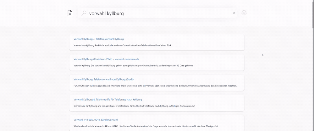
Figure 1. Semantic search in German language. English translated query is {area code kyllburg}. Sample index is based on the XGLUE benchmark dataset for cross-lingual understanding.
 Figure 2. Semantic search in French language. English translated query is {different literary movements}. Sample index is based on the XGLUE benchmark dataset for cross-lingual understanding.
Models and evaluations
The language models powering semantic search are based on our state-of-the-art Turing multi-language model (T-ULRv2) that enables search across 100+ languages in a zero-shot fashion. Using global data from Bing, these models have been fine-tuned across various tasks to enable high-quality semantic search features for multiple languages and have been distilled further to optimize for serving real-world online scenarios at a significantly lower cost. Below is a list of the various innovations that are powering semantic search today.
UniLM (Unified Language Model pre-training)
Graph attention networks for machine reading comprehension
Multi-task deep neural networks for natural language understanding
MiniLM distillation for online serving in real-life applications
Since their introduction, the models have been serving Bing search traffic across several markets and languages, delivering high-quality semantic search results to Bing users worldwide. Additionally, we have validated the quality of semantic ranking on Azure Cognitive Search using a variety of cross-lingual datasets – these include academic benchmark datasets (e.g. XGLUE web page ranking) as well as real-world datasets from services currently powered by Azure Cognitive Search (e.g. Microsoft Docs). Our results showed several points of gain in search relevance metrics (NDCG) over the existing BM25 ranker for various languages such as French, German, Spanish, Italian, Portuguese, Chinese and Japanese. For semantic answers, our evaluations were based on multiple datasets focused on Q&A tasks. Current academic benchmark leaderboards for Q&A scenarios measure accuracy of answer extraction for a given passage. However, our assessments were required to go a step further and consider more real-world intricacies involving multiple steps (see Figure 3) to extract an answer from a search index: (1) documents retrieval from the search index, (2) candidate passage extraction from the given documents, (3) passage ranking across candidate passages, and (4) answer extraction from the most relevant passage. We observed that our model accuracy for French, Italian, Spanish and German languages is equivalent to that of English language.
 Figure 3. Semantic answer extraction in Azure Cognitive Search.
Get started
The following table summarizes the set of languages and queryLanguage parameter values that we currently support via the REST API to enable semantic search on Azure Cognitive Search. Note that we have also added speller support for Spanish, French and German languages. For languages marked as “preview”, we encourage you out to try the capability for your search index and give us your feedback. For detailed instructions on how to configure semantic search for your target language, please refer to our documentation.
 Table 1. Supported languages for semantic search on Azure Cognitive Search.
Conclusion
With additional support for new languages, we are very excited to extend access to our state-of-the-art AI-enabled search capabilities to developers and customers worldwide. Please sign up for our preview to try out semantic search today!
References
https://aka.ms/semanticgetstarted
by Contributed | May 26, 2021 | Technology
This article is contributed. See the original author and article here.
Introduction
Formik is the world’s most popular open-source form library for React and React Native. We can also use this library in our SPFx web part as well to manage form validations. Using this library we don’t have to write custom validations. so let’s start step-by-step implementation.
What is formik?
Formik is a small library that helps us with the these parts: Getting values in and out of form state. Validation and error messages. Handling form submission.
Formik is designed to manage forms with complex validation with ease.
Formik supports synchronous and asynchronous form-level and field-level validation.
Furthermore, it comes with baked-in support for schema-based form-level validation through Yup.
For more details about Fromik refer to the below articles,
Formik official documentation
Manage Forms In React With Formik
Formik validation Schema
SharePoint List Structure
Create a list called Tasks with below fields,
Field Name(Internal name) |
Field Type |
Title (default) |
Single line of text |
StartDate |
Date and Time (Date only)
|
EndDate |
Date and Time (Date only) |
ProjectName |
Single line of text |
TaskDetails |
Multiple lines of text |
After the creation of the list, we will start to create the SPFx web part.
Formik implementation with SPFx
Open a command prompt
Move to the path where you want to create a project
Create a project directory using:
md react-formik
Move to the above-created directory using:
cd react-formik
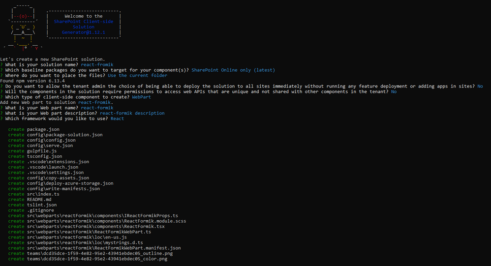
Now execute the below command to create an SPFx solution:
yo @microsoft/sharepoint
It will ask some questions, as shown below,
After a successful installation, we can open a project in any source code tool. Here, I am using the VS code, so I will execute the command:
code .
Now we will install the following packages:
npm i formik
npm i yup
npm i @pnp/spfx-controls-react
npm i @microsoft/sp-dialog
In the end, our output will be like this,

After the successful installation, we will start our form implementation.
1. Create below files
I{webpartname}State.ts inside src/webparts/reactFormik/components
SPService.ts file inside src/webparts/shared/service
In the end, our structure will be looks like this,

2. Create a state interface as below inside IReactFormikState.ts.
export interface IReactFormikState {
  projectName?: string;
  startDate?: any;
  endDate?: any;
}
3. Create a method to create a task inside SPService.ts.
import "@pnp/sp/webs";
import "@pnp/sp/lists";
import "@pnp/sp/items";
import "@pnp/sp/webs";
import "@pnp/sp/site-users/web";
import { Web } from "@pnp/sp/webs";

export class SPService {

    private web;

    constructor(url: string) {
        this.web = Web(url);
    }

    public async createTask(listName: string, body: any) {
        try {
            let createdItem = await this.web.lists
                .getByTitle(listName)
                .items
                .add(body);
            return createdItem;
        }
        catch (err) {
            Promise.reject(err);
        }
    }
}
4. Move to the ReactFormikWebPart.ts. In this, we will pass the current SP context and read site URL from user.
import * as React from 'react';
import * as ReactDom from 'react-dom';
import { Version } from '@microsoft/sp-core-library';
import {
  IPropertyPaneConfiguration,
  PropertyPaneTextField
} from '@microsoft/sp-property-pane';
import { BaseClientSideWebPart } from '@microsoft/sp-webpart-base';

import * as strings from 'ReactFormikWebPartStrings';
import ReactFormik from './components/ReactFormik';
import { IReactFormikProps } from './components/IReactFormikProps';
import { sp } from "@pnp/sp/presets/all";

export interface IReactFormikWebPartProps {
  description: string;
  siteUrl: string;
}

export default class ReactFormikWebPart extends BaseClientSideWebPart<IReactFormikWebPartProps> {

  protected onInit(): Promise<void> {

    return super.onInit().then(_ => {
      sp.setup({
        spfxContext: this.context
      });
    });
  }

  public render(): void {
    const element: React.ReactElement<IReactFormikProps> = React.createElement(
      ReactFormik,
      {
        description: this.properties.description,
        context: this.context,
        siteUrl: this.properties.siteUrl ? this.properties.siteUrl : this.context.pageContext.web.absoluteUrl
      }
    );

    ReactDom.render(element, this.domElement);
  }

  protected onDispose(): void {
    ReactDom.unmountComponentAtNode(this.domElement);
  }

  protected get dataVersion(): Version {
    return Version.parse('1.0');
  }

  protected getPropertyPaneConfiguration(): IPropertyPaneConfiguration {
    return {
      pages: [
        {
          header: {
            description: strings.PropertyPaneDescription
          },
          groups: [
            {
              groupName: strings.BasicGroupName,
              groupFields: [
                PropertyPaneTextField('description', {
                  label: strings.DescriptionFieldLabel
                }),
                PropertyPaneTextField('siteUrl', {
                  label: strings.SiteUrlFieldLabel
                })
              ]
            }
          ]
        }
      ]
    };
  }
}
5. Move to the ReactFormik.tsx file to render form and validations
yup syntaxs:
1. For string: yup.string().required(‘Required’)
2. For date: yup.date().required(‘Required’).nullable()
Related to Formik
1. Fromik has its own handleReset and handleSubmit method so we don not have to manage manually
2. We have to set state value and error message from control so for that I have created a common method
1. In the constructor, we will set the current SP context, bind the service and required methods and initialize the states.
2. Create createRecord() to create task list item using SPService.
3. In the render(), first we will add all the controls like date picker, text field, people picker, and dropdown, etc inside <Formik>.
then We will set properties as below,
initialValues – This is one type o state at here we will set empty or null or undefined as an initial level.
validationSchema – At here we will do validations using yup. so for this, I am creating one const and wills et this constant in this prop.
onSubmit – At here we will call the method to create a record in the SharePoint list
import * as React from 'react';
import styles from './ReactFormik.module.scss';
import { IReactFormikProps } from './IReactFormikProps';
import { IReactFormikState } from './IReactFormikState';
import { SPService } from '../../shared/service/SPService';
import { TextField } from '@fluentui/react/lib/TextField';
import { Stack, } from '@fluentui/react/lib/Stack';
import { Formik, FormikProps } from 'formik';
import { Label } from 'office-ui-fabric-react/lib/Label';
import * as yup from 'yup';
import { PeoplePicker, PrincipalType } from "@pnp/spfx-controls-react/lib/PeoplePicker";
import { DatePicker, Dropdown, mergeStyleSets, PrimaryButton, IIconProps } from 'office-ui-fabric-react';
import { sp } from '@pnp/sp';
import { Dialog } from '@microsoft/sp-dialog';

const controlClass = mergeStyleSets({
  control: {
    margin: '0 0 15px 0',
    maxWidth: '300px',
  },
});

export default class ReactFormik extends React.Component<IReactFormikProps, IReactFormikState> {

  private cancelIcon: IIconProps = { iconName: 'Cancel' };
  private saveIcon: IIconProps = { iconName: 'Save' };
  private _services: SPService = null;

  constructor(props: Readonly<IReactFormikProps>) {
    super(props);
    this.state = {
      startDate: null,
      endDate: null
    }
    sp.setup({
      spfxContext: this.props.context
    });

    this._services = new SPService(this.props.siteUrl);
    this.createRecord = this.createRecord.bind(this);
  }

  /** set field value and error message for all the fields */
  private getFieldProps = (formik: FormikProps<any>, field: string) => {
    return { ...formik.getFieldProps(field), errorMessage: formik.errors[field] as string }
  }

  /** create record in sharepoint list */
  public async createRecord(record: any) {
    let item = await this._services.createTask("Tasks", {
      Title: record.name,
      TaskDetails: record.details,
      StartDate: record.startDate,
      EndDate: new Date(record.endDate),
      ProjectName: record.projectName,
    }).then((data) => {
      Dialog.alert("Record inseterd successfully !!!");
      return data;
    }).catch((err) => {
      console.error(err);
      throw err;
    });
  }

  public render(): React.ReactElement<IReactFormikProps> {
    /** validations */
    const validate = yup.object().shape({
      name: yup.string().required('Task name is required'),
      details: yup.string()
        .min('15', 'Minimum required 15 characters')
        .required('Task detail is required'),
      projectName: yup.string().required('Please select a project'),
      startDate: yup.date().required('Please select a start date').nullable(),
      endDate: yup.date().required('Please select a end date').nullable()
    })

    return (
      <Formik initialValues={{
        name: '',
        details: '',
        projectName: '',
        startDate: null,
        endDate: null
      }}
        validationSchema={validate}
        onSubmit={(values, helpers) => {
          console.log('SUCCESS!! :-)nn' + JSON.stringify(values, null, 4));
          this.createRecord(values).then(response => {
            helpers.resetForm()
          });
        }}>
        { formik => (
          <div className={styles.reactFormik}>
            <Stack>
              <Label className={styles.lblForm}>Current User</Label>
              <PeoplePicker
                context={this.props.context as any}
                personSelectionLimit={1}
                showtooltip={true}
                showHiddenInUI={false}
                principalTypes={[PrincipalType.User]}
                ensureUser={true}
                disabled={true}
                defaultSelectedUsers={[this.props.context.pageContext.user.email as any]}
              />

              <Label className={styles.lblForm}>Task Name</Label>
              <TextField
                {...this.getFieldProps(formik, 'name')} />

              <Label className={styles.lblForm}>Project Name</Label>
              <Dropdown
                options={
                  [
                    { key: 'Project1', text: 'Project1' },
                    { key: 'Project2', text: 'Project2' },
                    { key: 'Project3', text: 'Project3' },
                  ]
                }
                {...this.getFieldProps(formik, 'projectName')}
                onChange={(event, option) => { formik.setFieldValue('projectName', option.key.toString()) }}
              />

              <Label className={styles.lblForm}>Start Date</Label>
              <DatePicker
                className={controlClass.control}
                id="startDate"
                value={formik.values.startDate}
                textField={{ ...this.getFieldProps(formik, 'startDate') }}
                onSelectDate={(date) => formik.setFieldValue('startDate', date)}
              />

              <Label className={styles.lblForm}>End Date</Label>
              <DatePicker
                className={controlClass.control}
                id="endDate"
                value={formik.values.endDate}
                textField={{ ...this.getFieldProps(formik, 'endDate') }}
                onSelectDate={(date) => formik.setFieldValue('endDate', date)}
              />

              <Label className={styles.lblForm}>Task Details</Label>
              <TextField
                multiline
                rows={6}
                {...this.getFieldProps(formik, 'details')} />

            </Stack>
            <PrimaryButton
              type="submit"
              text="Save"
              iconProps={this.saveIcon}
              className={styles.btnsForm}
              onClick={formik.handleSubmit as any}
            />
            <PrimaryButton
              text="Cancel"
              iconProps={this.cancelIcon}
              className={styles.btnsForm}
              onClick={formik.handleReset}
            />
          </div>
        )
        }
      </Formik >
    );
  }
}
6. Move to the ReactFormik.module.scss file to add some relaetd CSS.
@import '~office-ui-fabric-react/dist/sass/References.scss';
.reactFormik{
  .btnsForm {
    background-color: "[theme:themePrimary, default:#0078d7]";
    border-color: "[theme: themePrimary, default: #0078d7]";
    color: "[theme:white, default:white]" ;
    margin-left: 10px;
    margin-top: 10px;
  }
  .customErrorMeesage{
    color: var(--red-color);
    font-size: 10px;
    font-family: 'Light';
    padding: 2px;
  }
  .lblForm{
  font-size: 15px;
  margin:  5px 0px 5px 0px;
  }
}
Now serve the application using the below command,
gulp serve
Now test the webpart in SharePoint-SiteURL + /_layouts/15/workbench.aspx.
Output

Find the full source code here.
Summary
In this article, we have seen how to implement react formik library in SPFx.
I hope this helps.
Sharing is caring!!

Recent Comments