by Contributed | May 7, 2021 | Technology
This article is contributed. See the original author and article here.
Introduction
Wouldn’t it be nice to have a timer at meetings, so that everybody can see how much time has passed and how much is remaining? A timer for everybody to see. To make this transparent and accessible to everyone, I wanted to build a timer app which you can use in Teams meetings.
And since we all get better at delivering and receiving virtual meetings, workshops and events, we all discover different techniques on delivering content. In a lot of agile techniques, time plays a relevant role. If you’re familiar with agile software development, Scrum in general or Stand-up meetings you know how effective timeboxing can be.
So I build a timer app and made it Microsoft Teams ready :beaming_face_with_smiling_eyes:
I’m gonna share, how I build it, so you can build something similar with the timer control, which caused the whole idea.
You can also just download my sample, I’ve published on M365 PnP Power Platform Samples. You get all the images and all the code to use and improve it (tag me if you did, I’d love to see if this thing can grow ;)). It’s all for free y’know?
I will split this blog into two parts:
- Building the app
- Make it available in Microsoft Teams meetings
Prerequisites
To build this app you just need access to the maker portal of PowerApps. You don’t need any data source or premium connectors.
When you want to make the app available in Microsoft Teams meetings you need the administrative rights to upload custom build apps in your Teams.
Any code editor will come in handy (I prefer Visual Studio Code), but don’t worry, you don’t need to know how to write code or anything.
About the app
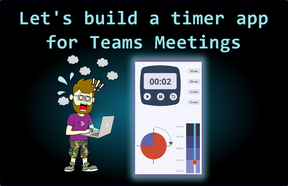
Before we start, here’s a picture of the finished app.

I build this in the portrait orientation, since I want it to be used in Teams meetings. That means, it has to fit in the meeting side panel.
In the upper half you see a classic timer which shows the remaining time and three buttons: Start, Stop and Reset.
You also have four buttons to set the timer to a certain duration. In this case I went for 10 seconds, 30 seconds, 3 minutes and 5 minutes.
In the lower half you see two things:
- A slider indicating the remaining time and a bar turning from blue to red as the time runs out.
- A pie chart divided into quarters to visualize the remaining time
Accessibility Note:
I’d like to make it very clear in the beginning, that the colors are no coincidence. Initially I started with a classic color scheme: red and green. But then I realized that red-green colorblindness is one of the most common visual disorders. I switched the colors to make sure that everybody can see everything on the screen.
On all the Power App applications you can find the checker symbol in the upper right corner. It’s a very easy step to make sure that your product (app or flow or slide or whatever) reaches more people. We want to include everyone, correct? Correct!


Building the app
We have three steps to set up this app:
- Build the timer in the upper half of the app.
- Build the visualization in the lower half of the app.
- Make it look pretty.
Build the timer in the upper half of the app
At first you start with inserting four things:
- One timer input.
- Three buttons for controlling the timer.
- Four buttons to set the timer.
You will use the buttons to start, stop and reset the timer (think about renaming your controls in the tree view to remain an overview over all your components). Here is how to edit the parts:
Timer input

Start by changing the Duration into a variable. I called it “Dauer” (sorry for the german, but you can call it whatever you like). The timer shows now the duration we put into that variable.
By default, the timer starts counting upwards, but since we want to show the remaining time, we have to customize the Text property:
Replace the default function
Text(Time(0, 0, Self.Value/1000), “hh:mm:ss”)
with this function
Text(Time(0, 0, (Timer4.Duration-Timer4.Value)/1000), “[$-en-US]mm:ss”)
Now the timer shows only the minutes and seconds and starts on whatever is written in the variable “Dauer”. And it’s ticking downwards. Not bad.
Buttons to set the timer
Now we have to work further with that variable Dauer we set the timer on.
You add four buttons and change the text to “10 sec”, “30 sec”, “3 min” and “5 min” (remember to use the “”, because the text is just a string ;))
The magic happens on the OnSelect property. Set it for each button to the following function:
10 sec button: UpdateContext({Dauer:10000})
30 sec button: UpdateContext({Dauer:30000})
3 min button: UpdateContext({Dauer:180000})
5 min button: UpdateContext({Dauer:300000})
The timer control works with milliseconds, so you have to type your desired duration in milliseconds. When you click one of the buttons, you change the variable “Dauer” to the specific value and since the timer value show whatever the variable Dauer is set to, you can choose the duration.
Now let’s take a look at the three buttons we want to use to control the timer.
Start Button
We set the OnSelect property to this function:
UpdateContext({ClockTicking: true})
We are initializing a variable named ClockTicking and set the value to true. When we’re already on it, we use the same variable for the Stop Button.
Stop Button
We set the OnSelect property to this function:
UpdateContext({ClockTicking: true})
This way we have buttons to control the variable here. Logically, we have to tell our Timer input that it has to use this variable to start and to stop.
Timer input
Change the Start property to ClockTicking
Since we want the timer to not automatically reset at the end, but to control it with the button, we set the OnTimerEnd property with this function:
UpdateContext({ResetIt:false}); UpdateContext({ResetIt: true})

Now we have a timer that can be set to the values of the four buttons on the right side AND we can control it with three buttons. Neat!
Next stop: the visualization.
Build the visualization in the lower half of the app
We have two parts here: the slider on the right side and the pie chart on the left. We’re going to start with the slider.
Slider Control
To build this, start to insert the slider control.

Now it’s time to flip it over.
Change the Layout property to Vertical
Set the Max property to Dauer/1000. This way it shows, whatever Dauer is.
And to link the position of the handle to what your timer is showing set the Default property to (Timer1.Duration-Timer1.Value)/1000
Now you already have a slider whose handle slowly moves down while your timer counts down.
How cool is that?
Before we make it pretty, we set up the last element.
The pie chart
This chart consists of five icons, put on top of each other. You will need the following icons:
- Circle (2x)
- Quarter circle (1x)
- Half circle (1x)
- Three-quarter circle (1x)

You need to layer these in the following order:

Set the Fill property to of the top four elements to some blue, the full circle at the bottom is going to be red. The exact colors don’t matter at this point. We will beautify the app in the last part, don’t worry.
Don’t worry about the looks, we will change them in the last chapter.
As the timer and the slider count down, you will, step by step, let the single icons disappear by setting the Visible property to the following function:
Full circle on top: If(Slider1.Value >=22.5,true,false)
Three-quarter circle: If(Slider1.Value >=15,true,false)
Half circle: If(Slider1.Value >=7.5,true,false)
Quarter circle: If(Slider1.Value >0,true,false)
When the timer reaches the value 22.5 the full circle on top will disappear, revealing the Three-quarter circle. That indicates that only three quarter of the time remains. It is important to place the circles on top of each other.
That is all you need to do. What’s left to do is, to make this whole thing pretty. Are you ready?
Make it look pretty
I will split this part, again, in three parts:
- The timer in the upper part
- The slider and the chart in the lower part
- The background
The timer in the upper part
I added a picture of a timer I’ve made myself. You can download and use it with the whole sample from the PnP Power Apps samples github repository.
You click on Insert > Media > picture to use that picture in your app. Now place it in the middle of the screen (Power Apps helps you with snapping it to the middle if you drag it near the middle).
Now you can remove the border and background from your…
- Timer input
- The Start Button
- The Stop Button
- And the Reset Button
In the Timer properties, change these values to transparent:

I did the same for the Start, Stop and Reset Button and placed them in the middle of a circle icon, I’ve added (Insert > Icon > Circle). Place the button over the circle icon and align it in the middle and in the center. You do that by right-clicking on the button and use the align feature. With Reorder you can also place the icon under the button.

Now select the icon and the button and group them (Ctrl+G), so you can place them in the spare holes of the timer picture.
In the end I group the whole timer pictures and all controls and labels to place them easily.
The slider and the chart in the lower part
I set the size and position values of the circles like this, but you can place them wherever you like:
Now for the slider. Set the size and position values like this:

Set the Handle size value to 50.
Set the Rail value to 20.
The four-colored scale behind the timer are four rectangle icons that I placed over each other.
The colors
Now there is one last step, you have to set all the correct colors, And of course, I have another little trick, if you are lazy (like me).
I like to set all the colors I’m going to use in an app in a variable. Then I can set the Fill or color value for each element to the name of the variable and don’t have to remember the hexcode for every color over and over again.
You want to set those variables on the OnStart property of the app itself, so the colors will show when, you start the app.

Here is the function that I used:
Concurrent(
    Set(
        Background_color,
        ColorValue("#f4f4fc")
    ),
    Set(
        Font_color,
        ColorValue("#484644")
    ),
    Set(
        Element_background,
        ColorValue("#e2e2f6")
    ),
    Set(
        Element_color,
        ColorValue("#484644")
    ),
    Set(
        Button_hover_Fill,
        ColorValue("#464775")
    ),
    Set(
        TheRed,
        ColorValue("#cc4a31")
    ),
    Set(
        Blurple_lightish,
        ColorValue("#6264a7")
    ),
    Set(
        Blurple_light,
        ColorValue("#8b8cc7")
    ),
    Set(
        Blurple_medium,
        ColorValue("#6264a7")
    ),
    Set(
        Blurple_darkish,
        ColorValue("#464775")
    ),
    Set(
        Blurple_dark,
        ColorValue("#33344a")
    )
)
Here is an overview on variables and their purposes.
Background_color:
|
the background of the app
|
Font_color:
|
Color property of the timer
|
|
Color property of the Duration buttons on the right
|
|
Color property of the scale labels next to the timer
|
Element_background:
|
Fill property of the duration buttons on the right
|
|
Fill property of the buttons to start, stop and reset the timer
|
|
ValueFill property of the slider
|
Element_color
|
Color property of the icons around the circles
|
Button_hover_Fill
|
HoverFill property of the timer
|
|
HoverFill property of the Duration buttons on the right
|
|
HoverFill property of the buttons to start, stop and reset the timer
|
TheRed
|
HandleFill property of the slider
|
|
Fill property of the red circle
|
Blurple_lightish
|
Fill property from the bottom rectangle behind the slider
|
Blurple_light
|
Fill property from the next larger rectangle behind the slider
|
Blurple_medium
|
Fill property of the blue circle on top
|
|
Fill property of the three-quarter circle
|
|
Fill property of the half circle
|
|
Fill property of the quarter circle
|
Blurple_darkish
|
Fill property from the second largest rectangle behind the slider
|
Blurple_dark
|
Fill property from the largest rectangle behind the slider
|
The result should look a lot like this:

As you can see, I added Fluent UI Icons on the buttons of the timer (if you don’t know how to use them, have a look at this awesome blog from Luise Freese), four lines around the circle to indicate quarters and halves and an arrow to make it look nice.
The lines around the circles are arrow icons.
The round arrow, is an image I uploaded. You can find it in my sample on PnP Power Platform Samples (you can also find the timer image and the icons. Everything’s included).
Next steps
Of course, I have a few more ideas in mind. I’m planning on adding two more steps next:
- I would like to set the timer by just typing a duration into it. Or into a label somewhere around. I want to set the timer to any duration I like, instead of choosing from just four buttons. But I have no idea how to do that. Help! :beaming_face_with_smiling_eyes:
- I would like to visualize the circle in the lower half differently. Currently it disappears at three quarters of the elapsed time, at half and at three quarters. I would like to see the circle count down a little bit smoother. But for this I still lack the idea for the implementation
I’d love to hear what you think about it. Dou you like it? Do you think it’s going to be helpful for yourself or your business? Do you think I should add a few more things?
by Contributed | May 6, 2021 | Technology
This article is contributed. See the original author and article here.
Welcome to Inclusive Bee: The monthly “buzz” on how MVPs can cultivate diverse and inclusive communities.
As an MVP and a tech leader, you are setting an example for the rest of the community. This month, MVPs are identifying four areas of focus as inclusive community leaders.
#1) Be a visible ally. Unfortunately, we live in a world where it is not safe to assume that everyone around you is an ally. Being a visible ally helps reassure people around you they are in a safe space to be themselves.
It’s up to you to decide how you choose to be a visible ally. It may be that you share resources on social media, add your preferred pronouns to your email signature, wear a rainbow lanyard at work, support charities and businesses owned and operated by BIPOC and LGBTQ+ people, amplify diverse voices of unrepresented minorities in tech, and more!
Data Platform MVP Andy Mallon shares: “As a cis white man, I know that I have the privilege of blending in in tech. When I started to be an active speaker/blogger/organizer, I made a conscious decision to be unabashedly out and queer. The directness sends a clear message of a safe space that extends beyond me. Over the years, this has led to folks approaching me to talk through personal and family situations of harassment, coming out, and transitioning. These conversations are usually less about getting advice, but rather just having a conversation where people are safe to be open and vulnerable.”
#2) Sponsor. A coach talks to you; a mentor talks with you; a sponsor talks about you. As a tech leader, you have the power and influence to help others get opportunities to advance their career. Sponsors are particularly important for women and people of color who often lack sponsorship opportunities – they may not feel like they can ask someone to sponsor them. Use your influence to connect someone to useful people, high profile assignments and promotions.
Business Apps MVP Paul Culmsee notes, “Microsoft’s vision statement is “empower everyone.” And it is reflected in most facets in how the company now operates in terms of product design, community engagement and recognition. Where we as MVPs and solution providers fit is bringing that vision down to the coalface of delivery. A fundamental part of my business is to bring in trainees who typically would not get an opportunity and have them work with us on solution delivery. For the right project and client, the results are incredible and there is something very exciting and satisfying about seeing latent talent being unleashed to its potential.”
#3) Listen. Listen to the people you are trying to support – follow them on social media and even better, read work by other people who are part of marginalized communities. Practice active listening to educate yourself. Learn to recognize things that are hurtful and harmful to the community. And, before you add your voice as an ally, make sure you have listened and heard what the people who are a part of those communities have to say.
Business Applications MVP Anton Robbins believes in standing up for the underdog. “I have empathy for those who do not have a voice or looked. I grew up in a domestic violence setting. As I got older, I vowed to speak up and stand my ground to help others. My great grandmother said: Stand for what’s right. Be a tree to shade others from the hurt and wrong.
#4) Say No. Have you been asked to speak at an event or on a panel? Great! Before committing, find out who the other speakers will be at the event or on your panel. Is it diverse? If not, you have the power to say “no” or ask “why not?”. If the organizers are willing, offer recommendations for additions to the panel or event.
Developer Technologies MVP Larene Le Gassick has experienced seeing both sides of the coin. “For context, I’m Australian-born and raised Chinese-Australian in her early 30s, my pronoun is she/her. As an organiser (Women Who Code, CTO School), I’ve put together many panels and, in the past, I’ve unconsciously invited a panel of six middle-aged white males to talk about DevOps.”
“Someone called me out (privately), and after a bit of embarrassment for not noticing, chatted with panellists and reached out to find non-male speakers, and was fully transparent with the community about my mistake. Don’t be afraid to respectfully reach out to organisers if you see a lack of diversity! As a speaker, I’ve said no to conferences that do not have a diversity scholarship. I’ve also said no to diversity and inclusion panels where the panellists are all white women (I class myself in the same category). The number one reason you’ll hear from organisers is: we know it’s an issue, but no women / black / (other minority) speakers applied. In 2020, that’s not good enough.”
“And please, do not let conference organisers give you extra work to help them find more speakers, unless you would like to. It’s not your job, it’s theirs. So, please don’t be afraid to say No, (thanks).”
Data Platform MVP Thomas LaRock shares, “Last year at a conference I raised concerns about a panel I was asked to participate. I stressed the need for diversity. As a result, I was dropped in order to make room for someone new. I’ve also turned down events that are heavily male. I also turned down a book because it was five white men. I’ve turned down so much in the past few years I think a lot of people have just stopped asking. I’m ok as long as I see new, diverse people and voices.”
by Contributed | May 6, 2021 | Technology
This article is contributed. See the original author and article here.
In my process of self learning regarding different technologies such us Azure, SPFX WebPart, React, Microsoft Graph, Node.js, Teams and all other Office 365 services, was surprise to find the current work already made by “Microsoft Graph Toolkit” and associated documentation on how to implemented with Microsoft Graph.
The amount of content and features already develop to integrate multiple platforms are definitely the Key to communicate with Office 365 and became easy to access content without a lot of effort, congrats to all the team.
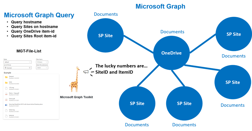
This sample use SharePoint Online SPFX WebPart with Mgt-File-List and Mgt-File Beta version control to retrieve Shared Libraries as existing in OneDrive, navigate between their folders and use filter by file extension in a simple way using Microsoft Graph API Drive and Site.
Below a draw resuming the custom query’s made and what control uses to retrieve associated folders and files from different locations.
How the Mgt-File-List Work
As OneDrive, this control allow to display Shared Files and Folders, for this ItemID (identity of the item to read, can be a folder or a file) has the main role on how to access content. To facilitate this access the control has multiple properties that allows call to content using different options such us: custom query’s (file-queries) or pre defined query’s (insight-type=”shared“).
This sample used the parameters SiteID (SharePoint Online Site ID) and ItemID it’s the ID of the root Library used on site to store documents and control to display files/folders from that Path and navigate between them.
Solution also uses the property File-List-Query that allows to search files inside shared Libraries.
<FileList
        siteId={this._siteID}
        itemId={this._itemID}
></FileList>
Where can I found SiteID of a site?
Use the Site Graph API with search query based on hostname to retrieve ID’s of sites.
"https://graph.microsoft.com/v1.0/sites?search=*****.sharepoint&$Select=id"
List of Site ID’s:
{
    "@odata.context": "https://graph.microsoft.com/v1.0/$metadata#sites(id)",
    "value": [
        {
            "id": "*******.sharepoint.com,000000-0000-0000-0000-000000,000000-0000-0000-0000-000000"
        },
        {
            "id": "*******.sharepoint.com,000000-0000-0000-0000-000001,000000-0000-0000-0000-000001"
        },
...
How can I found the Root Folder ItemID from Site?
This can be achieved using the SiteID from last query and call the drive root from Site.
https://graph.microsoft.com/v1.0/sites/*****.sharepoint.com,000000-0000-0000-0000-000000,000000-0000-0000-0000-000000/drive/Root?$select=id
This query returns the Item-id of the root Folder that can be used to display content in Control.
"id": "01CM5BY6********************************"
Retrieve OneDrive Root Folder Item-id
OneDrive is managed differently and there is no need of SiteID just make the following Drive call.
https://graph.microsoft.com/v1.0/me/drive/root/?$Select=id
PS: This query’s can be tested using the following site.
https://developer.microsoft.com/en-us/graph/graph-explorer
Below some additional Mgt-File-List documentation regarding possible options to use.
This main query will allow to fully explore the Mgt-File-List features that were used in sample “react-oneDrive-finder“
- List of Drives Sites
- Content List and Breadcrumb
- Filter of Items
- Filter by file extension
- Custom Theme styles

Mgt provider and SharePointProvider
It’s important that permissions are given from Microsoft Graph to SPFX WebPart that Mgt-File-List could make the necessary query’s.
Access to config/package-solution.json and ensure the following permissions are given on SharePoint package.
    "webApiPermissionRequests": [{
      "resource": "Microsoft Graph",
      "scope": "Files.Read"
  }, {
      "resource": "Microsoft Graph",
      "scope": "Files.Read.All"
  }, {
      "resource": "Microsoft Graph",
      "scope": "Sites.Read.All"
  }]
Access to your code into BaseClientSideWebPart area and ensure SharePoint Provider is loaded with the current security access that Mgt-File-List control and custom graph query’s could access to Microsoft Graph content.
import { Providers, SharePointProvider } from '@microsoft/mgt';
...
export default class OneDriveFinderWebPart extends BaseClientSideWebPart<IOneDriveFinderWebPartProps> {
  protected onInit() {
    Providers.globalProvider = new SharePointProvider(this.context);
    return super.onInit();
  }
...
After defining the provider you should be able to include control and use parameter’s id without permissions errors.
import { FileList } from '@microsoft/mgt-react';
...
<FileList
              siteId={this._siteID}
              itemId={this._itemID}
              itemClick={this.manageFolder}
            ></FileList>
Breadcrumb Navigation
It’s also possible to use Breadcrumb to include the path of folders where user is situated in the Library.
This can be achieve capturing the itemID of Folder listed in Mgt-File-List, using the event “itemClick={(e)=>{ console.log(e.details);}“.
More information can be found on Mgt-File-List documentation or by sample “react-onedrive-finder“.
Filtering file extensions
The Mgt-File-List property fileExtensions allows to filter documents by file extension, this can be very handy when dealing with large amounts of documents.
Code below shows how can be implemented a multiple file extensions filter.
 const checkFileExtensions = (event: React.FormEvent<HTMLDivElement>, selectedOption: IDropdownOption) => {
      let fileExtensions: string[] = [];
      if (selectedOption.selected == true) {
        fileExtensions.push(selectedOption.key.toString());
        fileExtensions = [...fileExtensions,...this.state.fileExtensions];
      } else {
        fileExtensions = this.state.fileExtensions.filter(e => e !== selectedOption.key );
      }
      this.setState({
        fileExtensions: [...fileExtensions]
      });
    };
.....
<Dropdown
	placeholder="Select"
	label="Select file extensions"
    multiSelect
    options={[
		  { key: "", text: 'folder' },
		  { key: "docx", text: 'docx' },
		  { key: "xlsx", text: 'xlsx' },
		  { key: "pptx", text: "pptx" },
		  { key: "one", text: "one" },
		  { key: "pdf", text: "pdf" },
		  { key: "txt", text: "txt" },
		  { key: "jpg", text: "jpg" },
		  { key: "gif", text: "gif" },
		  { key: "png", text: "png" },
		]}
	onChange={checkFileExtensions}
	styles={dropdownFilterStyles}
/>
...
<FileList
	fileExtensions={this._fileExtensions}
	...
/></FileList/>
Styling with Mgt-File-List
The Mgt-File-List includes Light and Dark theme but you can also provide your custom styles.
<FileList
    className="mgt-dark"
	...
></FileList>
To create your own custom style look and feel you can use css elements to customize Mgt-File-List.
Below some of the options available and shared in FileList Stories of the Beta Version.
.mgtfilelist {
  --file-list-background-color: #eff6fc;
  --file-item-background-color--hover: #deecf9;
  --file-item-background-color--active: #c7e0f4;
  --file-list-border: 0px solid #white;
  --file-list-box-shadow: none;
  --file-list-padding: 0px;
  --file-list-margin: 0;
  --file-item-border-radius: 0px;
  --file-item-margin: 0px 0px;
  --file-item-border-top: 1px solid #dddddd;
  --file-item-border-left: 1px solid #dddddd;
  --file-item-border-right: 1px solid #dddddd;
  --file-item-border-bottom: 1px solid #dddddd;
  --show-more-button-background-color: #fef8dd;
  --show-more-button-background-color--hover: #ffe7c7;
  --show-more-button-font-size: 14px;
  --show-more-button-padding: 16px;
  --show-more-button-border-bottom-right-radius: 12px;
  --show-more-button-border-bottom-left-radius: 12px;
}
Search in Shared Libraries
The control by the property “fileListQuery” also allow the usage Graph Drive Search method to find Items in the Drive. Below an sample on how you could use a dynamic to search items in Drives.
//Make query on Shared Library or OneDrive Library
const checkSearchDrive = (SearchQuery: string) => {
      if (this.state.siteID != "") {
        this.setState({
          searchDrive: "/sites/" + this.state.siteID + "/drive/root/search(q='" + SearchQuery + "')"
        });
      } else {
        this.setState({
          searchDrive: "/me/drive/root/search(q='" + SearchQuery + "')"
        });
      }
    };

//Search Box for Shared Library
<SearchBox placeholder="Search Drive" onSearch={checkSearchDrive} onClear={checkClear} />

//Display search content
{(this.state.searchDrive != "") &&
    <FileList
    fileListQuery={searchDrive}
	></FileList>
}
Final sample solution
Below the final result of the configuration of Mgt-File-List react controls:

Solution can be found in the SharePoint Framework Client-Side Web Part Samples – OneDrive finder:
https://github.com/pnp/sp-dev-fx-webparts/tree/master/samples/react-onedrive-finder
PS: Solution will be updated with release version when Mgt-File-List is available by the Microsoft Graph Toolkit.
How to start with Microsoft Graph Toolkit and SharePoint Online
There is a very good articles on how to start for example, Build a SharePoint web part with the Microsoft Graph Toolkit
To use the Mgt-File-List control in Beta version please use the following packages.
npm i @microsoft/mgt@next
npm i @microsoft/mgt-react@next
PS: The Microsoft Graph Toolkit Team made available access to Beta version of Mgt-File-List and react. Final version package can be monitor and accessible in microsoft-graph-toolkit.
I will hope this article could help you onboard when the Mgt-File-List control becomes officially available.
Support Documentation:


![[Event Recap] Humans of IT @ MBAS (May 4, 2021)](https://www.drware.com/wp-content/uploads/2021/05/fb_image-524.png)


Recent Comments