Joint NCSC-CISA-FBI-NSA Cybersecurity Advisory on Russian SVR Activity

This article is contributed. See the original author and article here.

CISA has joined with the United Kingdom’s National Cyber Security Centre (NCSC), the Federal Bureau of Investigation (FBI), and the National Security Agency (NSA), in releasing a Joint Cybersecurity Advisory on Russian Foreign Intelligence Service (SVR) tactics, techniques, and procedures. Further TTPs associated with SVR cyber actors provides additional details on SVR activity including exploitation activity following their initial compromise of SolarWinds Orion software supply chain.

CISA has also released Fact Sheet: Russian SVR Activities Related to SolarWinds Compromise that provides summaries of three key joint publications that focus on SVR activities related to the SolarWinds Orion supply chain compromise.

CISA strongly encourages users and administrators to review the joint advisory as well as the other two advisories summarized on thefact sheetfor mitigation strategies to aid organizations in securing their networks against Russian SVR activity.

Microsoft 365 PnP Community Spotlight: Stefan Bauer

Microsoft 365 PnP Community Spotlight: Stefan Bauer

This article is contributed. See the original author and article here.

stefanbauer.png


Which community project do you maintain? 


pnp/generator-spfx 


How does it help people?   


Allows people to create more advanced SPFx project with support for other frameworks VueJS, Handlebars and Angular Elements. 


What have you been working on lately? 


SPFx 1.12 integration 


What do you do at work? 


 Designer and Solution Architect. 


Why are you a part of the M365 community? 


Because of all the great people. 


What was you first community contribution? 


Make SharePoint 2010 responsive. 


One tip for someone who’d like to start contributing 


Just do it. 

AzUpdate: Azure Architecture Center updates, OneDrive Admin Reports, Hybrid for Linux and more

AzUpdate: Azure Architecture Center updates, OneDrive Admin Reports, Hybrid for Linux and more

This article is contributed. See the original author and article here.

Microsoft has been busy springing up new updates for both Azure Architecture Center and Azure Security Center. OneDrive Sync receives Admin Reports capabilities now in public preview. Azure Hybrid benefits are further being extended for Linux and a corresponding Linux on Azure Microsoft Learn Module of the week is ready to be reviewed on this week’s AzUpdate.


Azure Architecture Center Updates for April 2021


The Azure Architecture Center (AAC) helps you design, build, and operate solutions on Azure. The guidance is based on all aspects of building for the cloud, such as operations, security, reliability, performance, and cost optimization.


Microsoft has released three new documentation updates this week which would be of interest to IT Professionals:


  • Azure Automation Update Management – A configuration component of Automation. Windows and Linux computers, both in Azure and on-premises, send assessment information about missing updates to the Log Analytics workspace. Azure Automation then uses that information to create a schedule for automatic deployment of the missing updates.
     

  • Managing hybrid workloads using Windows Admin Center – This documentation shares how to design a hybrid Windows Admin Center solution to manage workloads that are hosted on-premises and in Microsoft Azure. The documentation covers both Windows Admin Center deployed to a virtual machine (VM) in Azure and Windows Admin Center deployed to a server (physical or virtual) on-premises.
     

  • Azure Automation in a Hybrid environment – This documentation details how to extend automation to on-premises or other cloud providers. It describes the services that must be deployed in Azure to provide automated management and configuration across on-premises or other cloud providers. The same architecture can be applied on Azure virtual machines (VMs) that reside behind a firewall, with outbound connectivity over the 443 TCP port.


Azure Security Center: General Availability and Public Preview updates for April 2021


In April 2021, the following generally available updates and enhancements were made to Azure Security Center:


The following public preview updates and enhancements made to Azure Security Center for April 2021 include:


Azure Hybrid Benefit for Linux with RI and VMSS Support now Generally Available


Microsoft recently announced Azure Hybrid Benefit for Linux, extending the ability to easily migrate RHEL and SLES servers to Azure beyond existing pay-as-you-go instances to include support for Azure Reserved Instance (RI) and virtual machine scale set (VMSS). While previous Bring-Your-Own-Subscription cloud migration options available to Red Hat and SUSE customers allowed them to use their pre-existing RHEL and SLES subscriptions in the cloud, Azure Hybrid Benefit for Linux improves upon this with several capabilities unique to Azure making enterprise Linux cloud migration even easier than before.


More informations surrounding the announcement can be found here: Azure Hybrid Benefit for Linux


OneDrive Sync Admin Reports now in Public Preview


Quickly resolve sync issues to help people stay productive.Quickly resolve sync issues to help people stay productive.


OneDrive Sync Admin Reports in Microsoft 365 Apps admin center provides more visibility into who in your organization is running the OneDrive Sync client and any errors they might be experiencing. Having insights into what’s happening with OneDrive Sync across your organization can help you proactively reach out to educate people to resolve common issues and improve user experience to help increase OneDrive adoption.


More information can be found here: OneDrive Sync Admin Reports


Community Events


MS Learn Module of the Week


Microsoft_Learn_Banner.png


Linux on Azure


This comprehensive learning path reviews deployment and management of Linux on Azure. Learn about cloud computing concepts, Linux IaaS and PaaS solutions and benefits and Azure cloud services. Discover how to migrate and extend your Linux-based workloads on Azure with improved scalability, security, and privacy. 


This learning path should be explored alongside the Azure Fundamentals part 1: Describe core Azure concepts learning path. If you’re new to cloud computing, consider taking the first learning path in the Azure Fundamentals 6-part learning path series first.


Modules include:


  • Discuss Azure fundamental concepts

  • Introduction to Linux on Azure

  • Introduction to Azure virtual machines

  • Create a Linux virtual machine in Azure

  • Describe core Azure architectural components

  • and more …


Learn more here: Linux on Azure


Let us know in the comments below if there are any news items you would like to see covered in the next show. Be sure to catch the next AzUpdate episode and join us in the live chat.

Let’s build a timer app for Teams meetings

Let’s build a timer app for Teams meetings

This article is contributed. See the original author and article here.

Header_TimerApp.png


Introduction


Wouldn’t it be nice to have a timer at meetings, so that everybody can see how much time has passed and how much is remaining? A timer for everybody to see. To make this transparent and accessible to everyone, I wanted to build a timer app which you can use in Teams meetings.


And since we all get better at delivering and receiving virtual meetings, workshops and events, we all discover different techniques on delivering content. In a lot of agile techniques, time plays a relevant role. If you’re familiar with agile software development, Scrum in general or Stand-up meetings you know how effective timeboxing can be.


So I build a timer app and made it Microsoft Teams ready :beaming_face_with_smiling_eyes:


I’m gonna share, how I build it, so you can build something similar with the timer control, which caused the whole idea.


You can also just download my sample, I’ve published on M365 PnP Power Platform Samples. You get all the images and all the code to use and improve it (tag me if you did, I’d love to see if this thing can grow ;)). It’s all for free y’know?


I will split this blog into two parts:


  1. Building the app

  2. Make it available in Microsoft Teams meetings


Prerequisites


To build this app you just need access to the maker portal of PowerApps. You don’t need any data source or premium connectors.


When you want to make the app available in Microsoft Teams meetings you need the administrative rights to upload custom build apps in your Teams.


Any code editor will come in handy (I prefer Visual Studio Code), but don’t worry, you don’t need to know how to write code or anything.


About the app


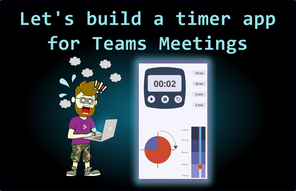
Before we start, here’s a picture of the finished app.


TimerApp.png


I build this in the portrait orientation, since I want it to be used in Teams meetings. That means, it has to fit in the meeting side panel.


In the upper half you see a classic timer which shows the remaining time and three buttons: Start, Stop and Reset.


You also have four buttons to set the timer to a certain duration. In this case I went for 10 seconds, 30 seconds, 3 minutes and 5 minutes.


In the lower half you see two things:


  1. A slider indicating the remaining time and a bar turning from blue to red as the time runs out.

  2. A pie chart divided into quarters to visualize the remaining time


Accessibility Note:


I’d like to make it very clear in the beginning, that the colors are no coincidence. Initially I started with a classic color scheme: red and green. But then I realized that red-green colorblindness is one of the most common visual disorders. I switched the colors to make sure that everybody can see everything on the screen.


On all the Power App applications you can find the checker symbol in the upper right corner. It’s a very easy step to make sure that your product (app or flow or slide or whatever) reaches more people. We want to include everyone, correct? Correct! 


Accessibility.pngPicture5.jpg


Building the app


We have three steps to set up this app:


  1. Build the timer in the upper half of the app.

  2. Build the visualization in the lower half of the app.

  3. Make it look pretty.


Build the timer in the upper half of the app


At first you start with inserting four things:


  • One timer input.

  • Three buttons for controlling the timer.

  • Four buttons to set the timer.


You will use the buttons to start, stop and reset the timer (think about renaming your controls in the tree view to remain an overview over all your components). Here is how to edit the parts:


Timer input


Timer.png


Start by changing the Duration into a variable. I called it “Dauer” (sorry for the german, but you can call it whatever you like). The timer shows now the duration we put into that variable.  


By default, the timer starts counting upwards, but since we want to show the remaining time, we have to customize the Text property:


Replace the default function


Text(Time(0, 0, Self.Value/1000), “hh:mm:ss”)


with this function


Text(Time(0, 0, (Timer4.Duration-Timer4.Value)/1000), “[$-en-US]mm:ss”) 


Now the timer shows only the minutes and seconds and starts on whatever is written in the variable “Dauer”. And it’s ticking downwards. Not bad.


Buttons to set the timer


Now we have to work further with that variable Dauer we set the timer on.


You add four buttons and change the text to “10 sec”, “30 sec”, “3 min” and “5 min” (remember to use the “”, because the text is just a string ;))


The magic happens on the OnSelect property. Set it for each button to the following function:


10 sec button:   UpdateContext({Dauer:10000})


30 sec button:   UpdateContext({Dauer:30000})


3 min button:    UpdateContext({Dauer:180000})


5 min button:    UpdateContext({Dauer:300000})


The timer control works with milliseconds, so you have to type your desired duration in milliseconds. When you click one of the buttons, you change the variable “Dauer” to the specific value and since the timer value show whatever the variable Dauer is set to, you can choose the duration.


Now let’s take a look at the three buttons we want to use to control the timer.


Start Button


We set the OnSelect property to this function:


 UpdateContext({ClockTicking: true})


We are initializing a variable named ClockTicking and set the value to true. When we’re already on it, we use the same variable for the Stop Button.


Stop Button


We set the OnSelect property to this function:


UpdateContext({ClockTicking: true})


This way we have buttons to control the variable here. Logically, we have to tell our Timer input that it has to use this variable to start and to stop.


Timer input


Change the Start property to ClockTicking 


Since we want the timer to not automatically reset at the end, but to control it with the button, we set the OnTimerEnd property with this function:


 UpdateContext({ResetIt:false}); UpdateContext({ResetIt: true})


Buttons.png


Now we have a timer that can be set to the values of the four buttons on the right side AND we can control it with three buttons. Neat!


Next stop: the visualization.


Build the visualization in the lower half of the app


We have two parts here: the slider on the right side and the pie chart on the left. We’re going to start with the slider.


Slider Control


To build this, start to insert the slider control.


Build_3.png


Now it’s time to flip it over.


Change the Layout property to  Vertical


Set the Max property to Dauer/1000. This way it shows, whatever  Dauer  is.


And to link the position of the handle to what your timer is showing set the Default property to  (Timer1.Duration-Timer1.Value)/1000 


Now you already have a slider whose handle slowly moves down while your timer counts down.


How cool is that?


Before we make it pretty, we set up the last element.


The pie chart


This chart consists of five icons, put on top of each other. You will need the following icons:


  • Circle (2x)

  • Quarter circle (1x)

  • Half circle (1x)

  • Three-quarter circle (1x)


Icons.png


You need to layer these in the following order:


Build_5.png


Set the Fill property to of the top four elements to some blue, the full circle at the bottom is going to be red. The exact colors don’t matter at this point. We will beautify the app in the last part, don’t worry.


Don’t worry about the looks, we will change them in the last chapter.


As the timer and the slider count down, you will, step by step, let the single icons disappear by setting the Visible property to the following function:


Full circle on top:          If(Slider1.Value >=22.5,true,false) 


Three-quarter circle:     If(Slider1.Value >=15,true,false) 


Half circle:                     If(Slider1.Value >=7.5,true,false) 


Quarter circle:               If(Slider1.Value >0,true,false) 


When the timer reaches the value 22.5 the full circle on top will disappear, revealing the Three-quarter circle. That indicates that only three quarter of the time remains. It is important to place the circles on top of each other.


That is all you need to do. What’s left to do is, to make this whole thing pretty. Are you ready?


Make it look pretty


I will split this part, again, in three parts:


  1. The timer in the upper part

  2. The slider and the chart in the lower part

  3. The background


The timer in the upper part


I added a picture of a timer I’ve made myself. You can download and use it with the whole sample from the PnP Power Apps samples github repository.


You click on Insert > Media > picture to use that picture in your app. Now place it in the middle of the screen (Power Apps helps you with snapping it to the middle if you drag it near the middle).


Now you can remove the border and background from your…


  • Timer input

  • The Start Button

  • The Stop Button

  • And the Reset Button


In the Timer properties, change these values to transparent:


Picture9.png


I did the same for the Start, Stop and Reset Button and placed them in the middle of a circle icon, I’ve added (Insert > Icon > Circle). Place the button over the circle icon and align it in the middle and in the center. You do that by right-clicking on the button and use the align feature. With Reorder you can also place the icon under the button.


Align.png


Now select the icon and the button and group them (Ctrl+G), so you can place them in the spare holes of the timer picture.


In the end I group the whole timer pictures and all controls and labels to place them easily.


The slider and the chart in the lower part


I set the size and position values of the circles like this, but you can place them wherever you like:Position.png


Now for the slider. Set the size and position values like this:


Position_Slider.png


Set the Handle size value to 50.


Set the Rail value to 20.


The four-colored scale behind the timer are four rectangle icons that I placed over each other.


The colors


Now there is one last step, you have to set all the correct colors, And of course, I have another little trick, if you are lazy (like me).


I like to set all the colors I’m going to use in an app in a variable. Then I can set the Fill or color value for each element to the name of the variable and don’t have to remember the hexcode for every color over and over again.


You want to set those variables on the OnStart property of the app itself, so the colors will show when, you start the app.


Picture10.png


Here is the function that I used:


Concurrent(
    Set(
        Background_color,
        ColorValue("#f4f4fc")
    ),
    Set(
        Font_color,
        ColorValue("#484644")
    ),
    Set(
        Element_background,
        ColorValue("#e2e2f6")
    ),
    Set(
        Element_color,
        ColorValue("#484644")
    ),
    Set(
        Button_hover_Fill,
        ColorValue("#464775")
    ),
    Set(
        TheRed,
        ColorValue("#cc4a31")
    ),
    Set(
        Blurple_lightish,
        ColorValue("#6264a7")
    ),
    Set(
        Blurple_light,
        ColorValue("#8b8cc7")
    ),
    Set(
        Blurple_medium,
        ColorValue("#6264a7")
    ),
    Set(
        Blurple_darkish,
        ColorValue("#464775")
    ),
    Set(
        Blurple_dark,
        ColorValue("#33344a")
    )
)


 Here is an overview on variables and their purposes. 


Background_color:


the background of the app


Font_color:


Color property of the timer


Color property of the Duration buttons on the right


Color property of the scale labels next to the timer


Element_background:


Fill property of the duration buttons on the right


Fill property of the buttons to start, stop and reset the timer


ValueFill property of the slider


Element_color


Color property of the icons around the circles


Button_hover_Fill


HoverFill property of the timer


HoverFill property of the Duration buttons on the right


HoverFill property of the buttons to start, stop and reset the timer


TheRed


HandleFill property of the slider


Fill property of the red circle


Blurple_lightish


Fill property from the bottom rectangle behind the slider


Blurple_light


Fill property from the next larger rectangle behind the slider


Blurple_medium


Fill property of the blue circle on top


Fill property of the three-quarter circle


Fill property of the half circle


Fill property of the quarter circle


Blurple_darkish


Fill property from the second largest rectangle behind the slider


Blurple_dark


Fill property from the largest rectangle behind the slider


The result should look a lot like this:


TimerApp.png


As you can see, I added Fluent UI Icons on the buttons of the timer (if you don’t know how to use them, have a look at this awesome blog from Luise Freese), four lines around the circle to indicate quarters and halves and an arrow to make it look nice.


The lines around the circles are arrow icons.


The round arrow, is an image I uploaded. You can find it in my sample on PnP Power Platform Samples (you can also find the timer image and the icons. Everything’s included).


Next steps


Of course, I have a few more ideas in mind. I’m planning on adding two more steps next:


  1. I would like to set the timer by just typing a duration into it. Or into a label somewhere around. I want to set the timer to any duration I like, instead of choosing from just four buttons. But I have no idea how to do that. Help! :beaming_face_with_smiling_eyes:

  2. I would like to visualize the circle in the lower half differently. Currently it disappears at three quarters of the elapsed time, at half and at three quarters. I would like to see the circle count down a little bit smoother. But for this I still lack the idea for the implementation


I’d love to hear what you think about it. Dou you like it? Do you think it’s going to be helpful for yourself or your business? Do you think I should add a few more things?


SharePoint Framework Community Call Recording – 6th of May, 2021

SharePoint Framework Community Call Recording – 6th of May, 2021

This article is contributed. See the original author and article here.

SharePoint Framework Special Interest Group (SIG) bi-weekly community call recording from May 6th is now available from the Microsoft 365 Community YouTube channel at http://aka.ms/m365pnp-videos. You can use SharePoint Framework for building solutions for Microsoft Teams and for SharePoint Online.


Call summary:


Preview the new Microsoft 365 Extensibility look book gallery co-developed by Microsoft Teams and Sharepoint engineering.  Download showcase apps, samples, and documentation.   Register now for May trainings on Sharing-is-caring  New releases in this call – CLI for Microsoft 365 v3.9.0, Reusable SPFx React Controls v3.1.0 and Property Controls v3.1.0 and SharePoint Framework v1.12.1. Also, a look at what’s ahead for SPFx – Microsoft Viva Connections, Teams improvements, tooling updates, and Store modernization. 


There were six PnP SPFx samples delivered in last 2 weeks, details below.  Great work!    


Latest project updates include:  (Bold indicates update from previous report 2 weeks ago) 


PnP Project Current version Release/Status
SharePoint Framework (SPFx) v1.12.1  GA 
PnPjs Client-Side Libraries v2.4.0 v2.5.0 scheduled for May 14th
CLI for Microsoft 365 v3.9.0 Upgrading SPFx projects to v1.12.1
Reusable SPFx React Controls v3.1.0 v2.7.0 (SPFx v1.11), v3.1.0 (SPFx v1.12.1)
Reusable SPFx React Property Controls v3.1.0 v2.6.0 (SPFx v1.11), v3.1.0 (SPFx v1.12.1)
PnP SPFx Generator v1.16.0 Angular 11 support
PnP Modern Search v3.19 and v4.1.0 April and March 20th


The host of this call is Patrick Rodgers (Microsoft) @mediocrebowler.  Q&A takes place in chat throughout the call.


210506-together-mode.gif


Thanks everybody for being part of the Community and helping making things happen. You are absolutely awesome!


Actions:


  • Reserve date – SharePoint Monthly community call – 11th of May 8 AM PDT | https://aka.ms/sp-call

  • Register for Sharing is Caring Events:

    • First Time Contributor Session – May 24th (EMEA, APAC & US friendly times available)

    • Community Docs Session – May

    • PnP – SPFx Developer Workstation Setup – May 13th  

    • PnP SPFx Samples – Solving SPFx version differences using Node Version Manager – May 20th

    • AMA (Ask Me Anything) – Tech Community – May 11th

    • AMA (Ask Me Anything) – Microsoft Graph & MGT – June

    • First Time Presenter – May 25th

    • More than Code with VSCode – May 27th  

    • Maturity Model Practitioners – May 18th

    • PnP Office Hours – 1:1 session – Register


  • Download the recurrent invite for this call – https://aka.ms/spdev-spfx-call


Demos:


  1. Adding support to add video with a text to modern pages with this video banner web part – from the Properties Pane, select a video, add banner title text and color it, adjust video brightness and banner height.  This elegantly coded modern web part was built with SPFx using standard PnP property pane controls in less than 3 hours.   Add the web part to top of your pages.   The web part has only one functional component named: VideoBackground. 


  2. Building company stories web part for story experience – this web part allows you to add images to a SharePoint List, and renders (cycles) them with related text on page similar to Instagram Stories as a way to engage social media adept employees. Text, images, and author details stored in a SharePoint list.   Uses an existing open-source React component called “react-insta-stories” and several Microsoft Graph Toolkit components.  Sample on github.   


  3. Building react groups and teams web part for aggregating detailed information for end users – this web part helps logged-in user quickly find their Microsoft Teams and Microsoft 365 Groups sites/content.  For selected site, options to go to site, mail, calendar, or Planner.  Match site color theme with one click.  Filter by public, private or all Groups/Teams.   The main React component is MirrosoftGroups.tsx.   A brilliant code walk-through by first time presenter Alison Collins. 


SPFx extension samples:  (https://aka.ms/spfx-extensions)


SPFx web part samples:  (https://aka.ms/spfx-webparts)


Thank you for your great work.  Samples are often showcased in Demos.    


Agenda items:


Demos:


  • Demo:  Adding support to add video with a text to modern pages with this video banner web part – Mohamed Derhalli (BDO Canada) | @MohamedDerhalli | Deck – 13:13


  • Demo:  Building company stories web part for story experience – Luis Mañez (ClearPeople) | @luismanez | Deck – 18:39


  • Demo:  Building react groups and teams web part for aggregating detailed information for end users – Alison Collins & Sam Collins (Coupled Technology) | @samc148 | Deck – 29:39


Resources:


Additional resources around the covered topics and links from the slides.


General Resources:


Other mentioned topics:


Upcoming calls | Recurrent invites:


PnP SharePoint Framework Special Interest Group bi-weekly calls are targeted at anyone who is interested in the JavaScript-based development towards Microsoft Teams, SharePoint Online, and also on-premises. SIG calls are used for the following objectives.


  • SharePoint Framework engineering update from Microsoft

  • Talk about PnP JavaScript Core libraries

  • Office 365 CLI Updates

  • SPFx reusable controls

  • PnP SPFx Yeoman generator

  • Share code samples and best practices

  • Possible engineering asks for the field – input, feedback, and suggestions

  • Cover any open questions on the client-side development

  • Demonstrate SharePoint Framework in practice in Microsoft Teams or SharePoint context

  • You can download a recurrent invite from https://aka.ms/spdev-spfx-call. Welcome and join the discussion!


“Sharing is caring”


Microsoft 365 PnP team, Microsoft – 7th of May 2021