This article is contributed. See the original author and article here.
Prerequisites: Complete basic dashboards Setup (Part 1 in this series); Log Analytics Workspace configured (ref – Monitor workload – Azure portal – Azure Synapse Analytics | Microsoft Docs)
As a first step, please download the log analytics queries in this GitHub repo that we will be using to set up the following custom dashboards. We are going to create the following charts in this article:
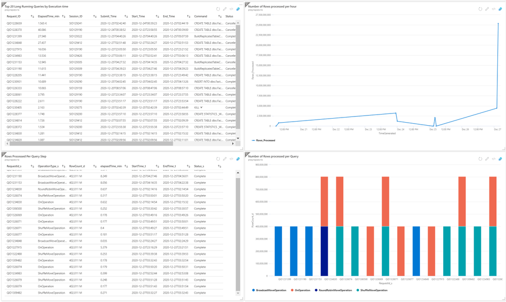
- Top 20 Long Running Queries by Execution time in a given interval
- Number of Rows processed per hour
- Most Rows Processed Per Query step
- Number of Rows processed per Query
Navigate to the Log Analytics workspace you configured to receive Synapse diagnostic data as shown below.

Close out the ‘queries’ popup and paste in the text from ‘Top20LongrunningQueries.txt’ file in the GitHub link provided above (image below for your reference). Replace the database name with your database name.


You can save the query for future use with a name that corresponds to the query goal. For example, ‘LongRunningQueriesbyexecutiontime’


Press ctrl-A to select all the contents in the query window, including the commented out portions. Press Run to execute the Query. Once you get the results, select ‘Pin to dashboard’ then in the popup choose the dashboard we are working on and click ‘pin’

Navigate to your dashboard and find the chart that you just pinned. Click the pencil icon to rename the chart to fit the purpose.

In the popup at the top of the window click ‘save’ – you will want to do this each time you make a change or all the changes you made will be discarded.

Navigate back to the log analytics workspace and paste in the text from the file ‘Top20Stepsthatmovedmostnumberofrows.txt’ that you downloaded. Save the query, select all the contents in query window and run. Once you get the results, pin it to the dashboard.
Without leaving the query window, click the ‘Chart’ button. The output will switch to a chart view. Set the 3 parameters as shown in the screenshot below – note that you will need to set ‘OperationType_s’ first to be able to set the first parameter to RequestID_s. Pin this chart to the dashboard as well.

Navigate back to the dashboard and rename both the charts and save the dashboard.

Repeat the process for query, RowsProcessedPerHour.txt as well and pin the chart to the dashboard.
Now for all the above 4 charts, click the context menu option (ellipsis button to the top right corner) and select configure tile settings. Make sure to uncheck the “Override the dashboard time settings at the tile level” option. This will let you automatically refresh the chart for the interval selected on the dashboard. It is important to configure this setting to interpret the results which will be discussed in the 3rd part in this series.

Brought to you by Dr. Ware, Microsoft Office 365 Silver Partner, Charleston SC.

Recent Comments