This article is contributed. See the original author and article here.
The first release wave of 2023 kicks off in just a few weeks! You’re invited to get a sneak preview of what’s new at the Microsoft Business Applications Launch Event, streaming live on April 4 at 9:00 AM Pacific Time. Tune in live, or on-demand after the live broadcast, for news and demos showcasing some of the hundreds of product features and innovation heading to Microsoft Dynamics 365 and Power Platform.
Sign up for the event today for reminders, agenda updates, and instructions to tune in live from your desktop or mobile device.
Business Applications Launch Event
The latest updates across Microsoft Dynamics 365 and Power Platform
What to expect at the Business Applications Launch Event
Featuring news and product demos, the event will cover updates launching between April and September 2023 across business rolesfrom marketing, sales, and service to supply chain and financeas well as low-code innovation for everyone in the organization. Tune in to learn about:
The very latest on AI-powered copilots that work alongside you to help create ideas and content faster, complete time-consuming tasks, and get insights and next best actions.
A preview of new ways to deliver more personalized and engaging customer experiences across marketing, sales, and service.
A host of new capabilities that will bring more insight, visibility, and automation across supply chain, operations, and finance roles.
New capabilities for low-code development to help teams manage building apps, storing data, and modernizing customer experiences with improved governance and scalability.
Updates across Microsoft Power Platform for governance and administration, pro development, ISV experiences, and data integration.
And there’s much more in store. You’ll also see how these solutions work for businesses like yours with demos hosted by Microsoft product experts. You’ll hear from Charles Lamanna, Microsoft Corporate Vice President of Business Applications and Platforms, about how to innovate with business applications to grow your business faster than ever. The team behind the Dynamics 365 and Microsoft Power Platform 2023 release wave 1 will also share insights and guide you through how all these updates, advancements, and new tech will help you:
Expand visibility, reduce time, and enhance creativity in your departments and teams with unified, AI-powered capabilities.
Empower your employees to focus on revenue-generating tasks while automating repetitive tasks.
Connect people, data, and processes across your organization with modern collaboration tools.
Innovate without limits using the latest in low-code development, including new next-generation AI capabilities.
AI innovations
A major theme of this digital event is the evolution of AI. Leaders in the field will show you some of the latest developments in AI that are leading the next generation of business applications. You’ll also have the opportunity to join us for a special session that includes a deep dive into the tech behind next-generation AI hosted by Dr. Walter Sun, Microsoft Vice President, AI in Business Applications. Throughout the event, you’ll receive expert guidance on how to build more agile, customer-focused teams by empowering your solutions with AI and see firsthand how to get more value out of your data, collaboration, and tools.
Insights from the experts
Find out how to enhance the customer experience and operational excellence across your business with a look at real-life scenarios in expert-led demos of new capabilities and features. Gain valuable insights for overcoming your current challenges from other Microsoft customers who will share their journeys. And if you have any questions for the experts, ask them during a live Q&A chat.
For a range of key best practices, strategies, and insights applicable to organizations across many industries, you don’t want to miss this digital launch event.
This article is contributed. See the original author and article here.
Nuance Gatekeeper is a biometric authentication and fraud prevention technology that can be integrated with Microsoft Dynamics 365 Customer Service. It offers a streamlined verification process that allows contact centers to identify customers through natural conversation without relying on specific questions, security codes, or secret questions and answers.
This technology provides a secure and seamless way to verify customer identities so call center agents can focus their attention on serving these individuals. The results include increased customer satisfaction and reduced average call handling times. By using voice biometrics, Nuance Gatekeeper can quickly and accurately verify a customer’s identity, significantly reducing the risk of fraud and protecting customers’ personal data from unauthorized access.
The integration of Nuance Gatekeeper into the Microsoft Digital Contact Center Platform (DCCP) is a significant step forward in improving the customer experience and enhancing contact center security. It allows businesses to provide fast, personalized service while maintaining the highest levels of security and compliance.
We are announcing the opportunity to preview Nuance Gatekeeper services for all customers using the voice channel in their contact centers. Microsoft is inviting interested customers to explore the capabilities of this technology and see how it can improve their operations. Customers must nominate themselves at the Dynamics Insider portal to experience the benefits of this innovative solution firsthand.
Biometric authentication
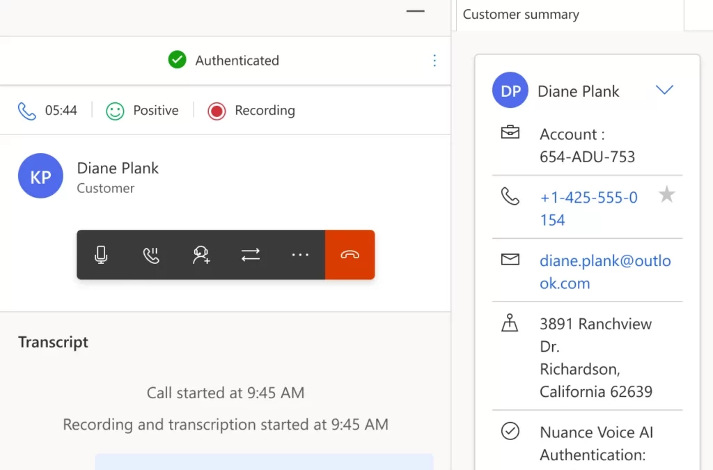
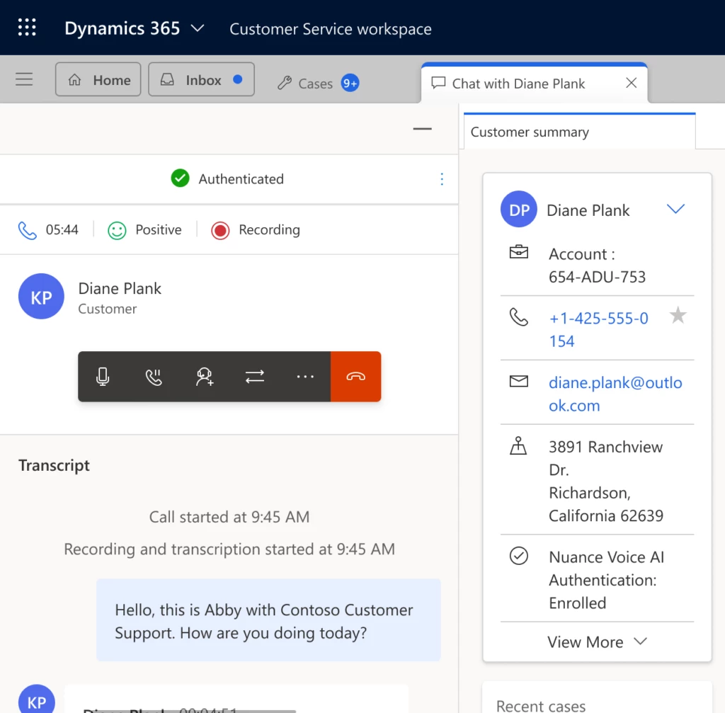
As part of DCCP and Dynamics 365 Customer Service, Nuance Gatekeeper uses strong biometric authentication to reduce friction and send customers on their way to a fast resolution. They won’t have to share sensitive personal data to authenticate themselves, and they can use voice authentication on an opt-in basis. Customers can opt out of biometric authentication at any time.
Dynamics 365 Customer Service agents can enroll customers in biometric authentication and verify customer identity in each subsequent call. Nuance Gatekeeper alerts agents to suspected fraudsters and flags fraudulent conversations. Agents have insight into the customer’s full consent history.
Contact center administrators can configure specific channels to use Nuance Gatekeeper services within their omnichannel environments and determine the parameters for authentication.
Conversation with an authenticated customer in Dynamics 365 Customer Service
Fraud prevention
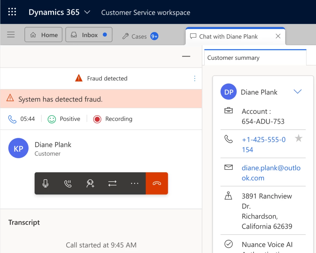
Stop fraudsters in their tracks while kicking customer interactions into high gear. Nuance Gatekeeper can detect fraudulent calls before they reach the contact center agent while giving legitimate customers the greenlight for personalized support.
In addition to caller authentication, fraud detection capabilities prevent attackers from usurping your customers’ identities using layered methods including a suspected fraudsters watchlist, and synthetic speech and playback detectors. Additional factors like device, network, and location signals help identify suspicious activity.
Nuance Gatekeeper checks caller voices against a watchlist to alert the contact center agent about known fraudsters. The agent can then take steps outlined in their organization’s fraud detection policy. If the caller isn’t flagged but the agent finds the caller suspicious, the agent can manually flag the conversation within their workspace in Dynamics 365 Customer Service.
Fraud teams can use the information gathered by contact center agents to block fraudsters, analyze fraud patterns and trends, and gather data to assist law enforcement.
Conversation with fraud detected in Dynamics 365 Customer Service
This article is contributed. See the original author and article here.
Windows updates keep you protected and productive in different ways, and we continue to optimize the update experience. Whether you’re an IT administrator or a general user, Windows monthly updates provide you with the security fixes to help keep your devices protected—as well as enhancements based on your feedback. Monthly updates are cumulative and include all previously released fixes to guard against fragmentation of the operating system (OS). This contributes to the reliability and quality of the Windows platform.
This post summarizes the different types of monthly updates and shares insights on how we’ve optimized our approach to Windows servicing and delivery.
Monthly security update release
For many of you, Update Tuesday (also referred to as “Patch Tuesday”) is a regular part of Windows servicing. Published on the second Tuesday of each month, our security update releases are cumulative. That is, they include both new and previously released security fixes along with non-security content introduced in the prior month’s optional non-security preview release (see below). These updates help keep Windows devices secure and compliant by deploying stability fixes and addressing security vulnerabilities.
Note: People tend to use “B release,” quality update, security update, and LCU interchangeably.
Monthly security updates are mandatory and are available through our standard channels, which include Windows Update, Windows Update for Business, Microsoft Intune, Microsoft Configuration Manager, Windows Server Update Services (WSUS), and the Microsoft Update Catalog.
Optional non-security preview release
You’ve got options with optional non-security preview releases. Available the fourth week of the month, these production-quality updates are released ahead of the planned security update release for the following month. In addition, new features, like Search highlights, may initially be deployed in the prior month’s optional non-security preview release, then ship broadly in the following month’s security release.
Note: The term “optional non-security preview release” now replaces what we used to call either a “C” or “D” release to align with the current process.
Optional non-security preview releases are also cumulative and are only offered for the most recent supported versions of Windows.
Starting in April 2023, we now target optional non-security preview releases for the fourth week of the month. We have found this to be the optimal time for us to publish and for you to consume these updates. That’s two weeks after your latest monthly security update and about two weeks before you’ll see these features become part of the next mandatory cumulative update. We’re excited for this improvement as it is meant to optimize the validation of payloads, improve consistency, and enhance the predictability of your testing, update, and upgrade experience.
To access optional non-security preview releases, navigate to Settings > Windows Update > Advanced options > Optional updates, select from the available updates, and click Download and install.
Out-of-band releases
Out-of-band (OOB) releases may be provided to fix a recently identified issue or vulnerability. They are used in atypical cases, such as security vulnerabilities or a quality issue, when devices should be updated immediately instead of waiting for the next monthly quality update release. Out-of-band releases are cumulative, meaning that they include the updates from the previous security and/or non-security release, as well as the additional fix.
Continuous innovation in Windows 11
Beginning with Windows 11, version 22H2, new features and enhancements are delivered to the most recently released in-market version of Windows 11 more frequently using servicing technology. As with all updates, we utilize a phased and measured approach in rolling out continuous innovation to the Windows 11 ecosystem.
Experiences may be introduced in an optional non-security preview release prior to being made available broadly via a monthly security update or via Controlled Feature Rollout (CFR) technology. For more information on how to control when select features introduced via servicing are released to the devices you manage, see Commercial control for continuous innovation.
Recommendations
As a general practice, we recommend that you update your devices as soon as possible, whether you’re a general user or an IT professional. For IT admins, we also recommend taking advantage of the optional non-security preview releases to internally validate releases ahead of the following month’s security update release.
To help manage updates across your organization, bookmark these resources:
Windows release health on Microsoft Learn (also available in the Microsoft 365 admin center)
These pages are available in multiple languages and refer to each release by a unique KB number.
IT admins may validate fixes and features in a preview release by leveraging the Windows Insider Program for Business or via the Microsoft Update Catalog.
If you are a Microsoft Partner or registered commercial customer, you can also take advantage of the Security Update Validation Program (SUVP). It’s a quality assurance testing program designed for the monthly security update release. As a SUVP partner, you can start testing these security updates three weeks prior to Update Tuesday and provide us with feedback regarding usability, bug reports, test reports, etc.
This article is contributed. See the original author and article here.
Across Dynamics 365, Power Platform, and Viva Sales, we’ve introduced, and will continue delivering, a cascade of AI capabilities to help businesses and individuals achieve more. Earlier this month, we announced Dynamics 365 Copilot, which uses OpenAI’s GPT capabilities to provide AI-powered assistance across business functions. For instance, a smart news insights capability for Microsoft Supply Chain Platform alerts warehouse and logistics professionals to external events, such as weather or geo-political activities, that might trigger a disruptionand then proactively helps them plan their mitigation with Copilot-powered content.
GPT-4 will bring more powerful capabilities to Microsoft business applications
The Azure OpenAI service uses large-scale, generative models to unlock new reasoning and comprehension capabilities across our business applications. Our unique and strong collaboration with OpenAI creates a “better together” experience for our customers. We’ve taken OpenAI models and built features on top of them, experimenting with multiple available models, including text-davinci-002 and text-davinci-003, ChatGPT, and GPT-4, the newest and most capable model in the GPT series.
These examples provide insight into how GPT-4 will create new possibilities to bring customers additional business value and where it may be better suited to address certain scenarios. We incorporate various models from OpenAI and Microsoft depending on the product and scenario. Some more complex tasks may be suited for one model, while others could be powered just as welland perhaps more quicklywith a different model.
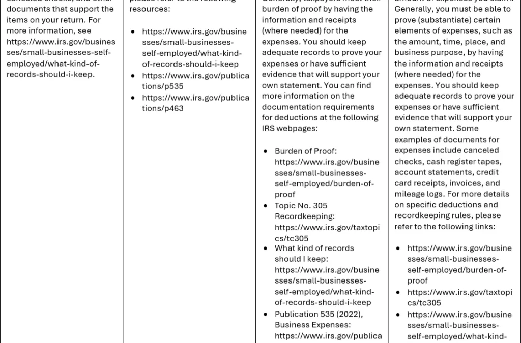
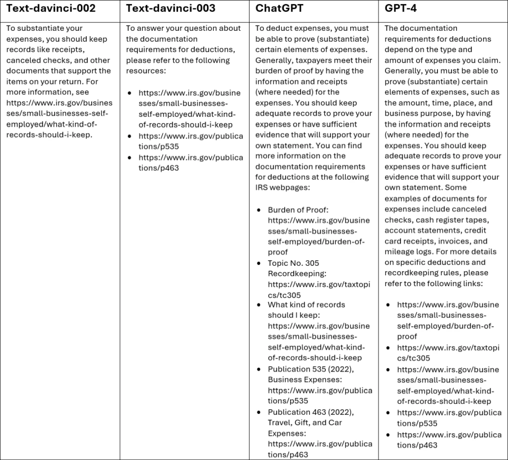
Here’s an example of an experiment using Power Virtual Agents conversation booster in a fictional customer scenario to help the Internal Revenue Service (IRS) answer this question from their users: What are the documentation requirements for deductions?
domain = “irs.gov” query = “What are the documentation requirements for deductions?”
In contrast with text-davinci-002 and text-davinci-003, which mostly provide references, ChatGPT and GPT-4 provide more explanatory information along with links to their sources.
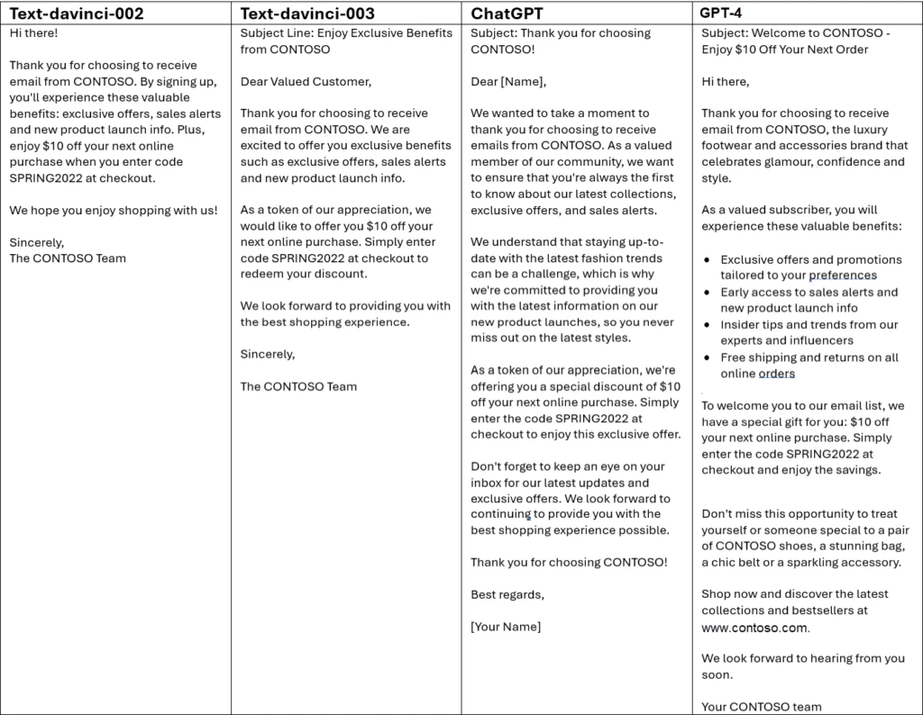
In Dynamics 365 Marketing, content ideas uses AI to generate marketing copy. In the following experiment, we asked for newsletter content around three key points:
Thank you for choosing to receive email from CONTOSO
Experience these valuable benefits: exclusive offers, sales alerts and new product launch info
Enjoy $10 off your next online purchase, enter code SPRING2022 at checkout
Then we performed internal testing to evaluate the results from the four models.
As with the IRS example, GPT-4 provides the most detailed response, including a bullet list of benefits. It even added an encouragement not to miss the opportunity, implicitly understanding that a coupon code should have a time component.
Prompt engineering and model tuning
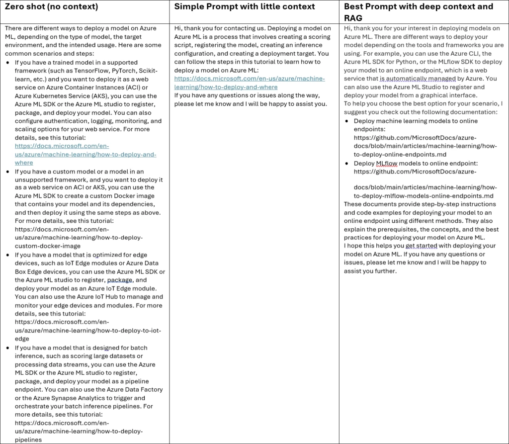
Through our access to OpenAI models, we had the opportunity to engineer context-specific prompts for each scenario we tested. Consider the following example, in which we supplied various levels of context as input for the question, Do you know how to deploy a model on Azure ML?.
Without context, known as “zero shot,” the response from GPT-4 is random, not knowing which scenario is intended. The response with some context is more targeted. The most comprehensive context, which included retrieval augmented generation (RAG) from the desired sources, resulted in the most targeted response.
Along with engineering more context-rich prompts, we went under the hood to tune some models with training samples from domain-specific languages. For instance, the Power Automate “describe it to design it” capability shipped in October 2022 uses a model trained with samples that better represent the cloud flow language. For details, see our blog post explaining how we build fine-tuned models.
Our experimentation, tuning of input and models, and collaboration with OpenAI enable us to quickly develop and deliver the best AI-powered capabilities to our business users. And we’re doing it in a way that helps mitigate harm and provides our customers with provenance-checked results by implementing our Responsible AI practices.


Recent Comments