by Contributed | Mar 19, 2021 | Technology
This article is contributed. See the original author and article here.
Introduction
In a previous blog post, the basic building blocks of custom column formatting were introduced to us. From that, we learned how to customize our columns to create some interesting visuals.

Things look better, but each column is still a separate component. What if we want to tie them all together into a more cohesive presentation?
The good news is that we can! Just like we customized our columns, we can also customize SharePoint list views! That will allow us to go from a traditional table/column/cell view, to something that looks ‘put together’, like so…

Preparing for your journey
Before you get going, there are a few things that will help prepare you for the trek ahead.
If you haven’t, I would highly recommend reading the first blog post in this series: Getting started with SharePoint’s custom column formatting.
You can also refer to the official documentation for view formatting to help fill in any gaps not covered here.
I should also warn you that your HTML and CSS skills are going to come into play a lot more here, as you’ll be trying to work with multiple elements to position them correctly.
If you’re not an expert, that’s perfectly okay – I’m not one either – you’ll just need an extra dose of patience. Trial and error will get you there, eventually. I’m not going to dwell on the particular CSS used in these examples except in cases where it’s a pattern that could be applied to other use cases.
And that’s pretty much it. There’s some new stuff we’ll learn about that only applies to View formatting, but everything we learned from the previous blog post will apply here as well.
Choose your own adventure
In case you weren’t aware, views in a Modern SharePoint list come in a few flavors.

Most of us are probably already very familiar with the List layout; It’s what we’ve been used to for decades. Compact List is the same as List…just smaller. The Tiles view, frequently referred to as the Gallery view, is somewhat newer. As you may expect, it will display your list items as cards/tiles in a classic grid view. There’s also a Calendar view/layout that was recently added, but is not currently customizable.
When it comes to custom formatting, we can customize both the List and Gallery layouts. They do need to be customized separately, as their schemas are slightly different, but they’re close enough that you can usually take your JSON from one and apply it to the other with minimal changes.
For our journey here, we’re going to start with a List view and then use it to create a Tile view.
I wisely started with a map
Before we get into defining our custom view formatting, it may be helpful to spend some time up front thinking about how we’ll structure our view. The more you want to transform your view, the more important it will be to plan things out in advance. This is where some understanding of HTML will come in handy.
To help guide myself, I created the following image to try and visualize how my various DIVs and other elements would be laid out.

This isn’t necessary, obviously, but I personally find it helpful to have a blueprint in front of me (even if it’s only a mental one).
Formatting List views
If you recall from the column formatting article, each custom format followed the same basic structure: A $schema definition along with a parent HTML element and optional attributes, styles and children.
{

    “$schema”: “https://developer.microsoft.com/json-schemas/sp/v2/column-formatting.schema.json”,

    “elmType”: “div”,

    “attributes”: {

        “iconName”: “Game”

    },

    “style”: {

        “font-size”: “48px”,

        “color”: “red”

    },

    “children: []

}
List views aren’t that much different.
{

    “$schema”: “https://developer.microsoft.com/json-schemas/sp/v2/row-formatting.schema.json”,

    “hideSelection”: true,

    “hideColumnHeader”: true,

    “rowFormatter”: {}

}
We still have our $schema property, but it’s important to notice that it’s pointing to a different schema definition. We also have some new optional properties: hideSelection & hideColumnHeader. As you may suspect, hideSelection will do away with the ability to select a particular list item while hideColumnHeader will do away with the the column headers normally present on a list.
What’s a little different here is that we’re missing our parent element. Instead, we have this rowFormatter property. The reason for this is that we can choose between using this and an additionalRowClass property. If you choose the latter, you’re limited to applying CSS classes to the entire row, similar to what you can do with the out-of-box “Conditional formatting”. If all you want to do is make your row a different color, you’re probably better off using the design mode tools, but if you’re interested in learning more about the additionalRowClass property, it is covered well enough in the official documentation.
We, however, will not be satifisfied with applying some simplistic styling. NO! We are bound for greater rowFormatter glory!
NOTE: There are other properties available that are not covered in this blog, most notably the groupProps property. This allows you to customize the grouping header that appears when items are grouped together by some column. There are also footerFormatter and hideFooter properties that affect the “List Footer” that appears if you’re displaying item totals.
One container to rule them all
The rowFormatter property is simply an object that wraps all of the HTML elements we’re going to create our view. If, for some reason, we wanted every row in our list to just simply display the basic column formatting shown in the previous section, we’d end up with the following JSON definition.
{

    “$schema”: “https://developer.microsoft.com/json-schemas/sp/v2/row-formatting.schema.json”,

    “hideSelection”: true,

    “hideColumnHeader”: true,

    “rowFormatter”: {

        “elmType”: “div”,

        “attributes”: {

            “iconName”: “Game”

        },

        “style”: {

            “font-size”: “48px”,

            “color”: “red”

        },

        “children: []

    }

}
That’s probably not the greatest idea, but it does illustrate the point. Once we make it inside of the rowFormatter object, it’s almost business as usual. There’s one more difference we need to understand…how we reference columns.
How to reference fields
When we were dealing with formatting individual columns, we always used the built-in variable @currentField, but what about when we’re dealing with more than one view? @currentField is still there, but it holds a slightly different meaning in this context. It will always be a reference to the standard Title field.

Instead of using @currentField to reference a column, we’ll need to use a slightly different format: [$InternalColumnName].
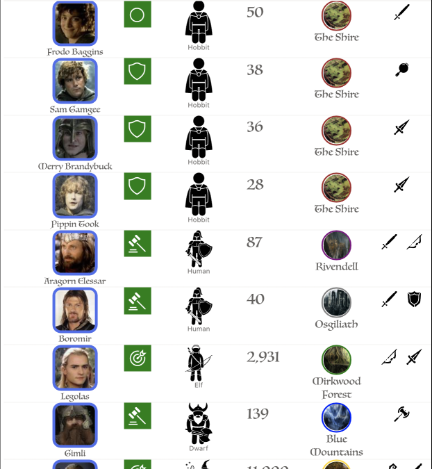
In our list, we have a handful of columns including a Member lookup column. If we want to reference that field, we’d use [$Member]. Even if we change the display name from “Member” to “Hero”, our variable would still be [$Member]. And, since Member is a lookup column, if we want to show the display name of the user, we need to use the title property. We’d do that in the following way [$Member.title].
The World Is Not In Your Books And Maps. It Is Out There.
Alright. Enough with the lessons, it’s time to get started.
We can use the “map” we created earlier and turn it into a rough skeleton. Each layer in that blowout represent a parent/child relationship. So, by looking at our map…

We come up with this.
{

    “$schema”: “https://developer.microsoft.com/json-schemas/sp/v2/row-formatting.schema.json”,

    “hideColumnHeader”: true,

    “hideSelection”: true,

    “rowFormatter”: {

        “elmType”: “div”,

        “attributes”: { “title”: “Parent Container” },

        “children”: [{

            “elmType”: “img”,

            “attributes”: { “title”: “Background Image” },

            “children”: [{

                “elmType”: “div”,

                “attributes”: { “title”: “Column Container” },

                “children”: [

                    {

                        “elmType”: “div”,

                        “attributes”: { “title”: “Member/Role DIV” },

                        “children”: [

                            {

                                “elmType”: “img”,

                                “attributes”: { “title”: “Large Member profile picture” }

                            },

                            {

                                “columnFormatterReference”: “[$Title]”

                            }

                        ]

                    },

                    {

                        “elmType”: “div”,

                        “attributes”: { “title”: “Text DIV” },

                        “children”: [{

                                “elmType”: “div”,

                                “attributes”: { “title”: “Member Name row/div” }

                            },

                            {

                                “elmType”: “div”,

                                “attributes”: { “title”: “Age row/div” }

                            },

                            {

                                “elmType”: “div”,

                                “attributes”: { “title”: “From row/div” }

                            }
                        ]

                    },

                    {

                        “elmType”: “div”,

                        “attributes”: {

                            “title”: “Race/Weapons DIV/Column”

                        },

                        “children”: [{

                                “elmType”: “div”,

                                “attributes”: { “title”: “Race icon DIV/Row” },

                                “children”: []

                            },

                            {

                                “elmType”: “div”,

                                “attributes”: { “title”: “Weapon icons DIV/Row” },

                                “children”: []

                            }

                        ]

                    }

                ]

            }]

        }]

    }

}
That’s the basic layout of our custom view, simply a series of parent and child divs. We’ll start filling this skeleton out with content shortly, but there are a couple of things to point out already.
First, there are several examples of this “attributes”: { “title”: “<TEXT>” } pattern. We can use this as a means of commenting about the purpose of the element, since comments aren’t allowed in valid JSON and would break our view. Again, this isn’t required and adds absolutely no value to the view itself. It does, however, help keep us (and any future adventurer) oriented as to where we are in our JSON.
NOTE: Using the title attribute will cause whatever you specify to be displayed as a tooltip when a user hovers over the element. You can remove your titles after you done, if that bothers you. Otherwise, just be aware that users may see your witty comments.
Also, in the “Member/Role DIV” children, the second child looks a little peculiar.
{

    “columnFormatterReference”: “[$Title]”

}
This columnFormatterReference property is a nifty shortcut that tells the view formatter to display the referenced field (Title, in this case) as it normally would, including any custom column formatting that may have been configured. This is a great opportunity for some reusability, especially if you want the column to show exactly the same way on every view.
If you take our skeleton and put it into SharePoint, there’s not going to be much to look at. So let’s fix that.
Putting some meat on the bone
Now that we’ve got our skeleton all rigged up, it’s time to fill it out some.
It’s certainly a little short and skinny, so let’s start by defining some CSS on our parent div. We know we want a border around the whole thing, as well as a particular font style and size, so we can apply those things at the top level.
“style”: {

    “position”: “relative”,

    “border”: “5px solid black”,

    “border-radius”: “10px”,

    “width”: “600px”,

    “height”: “175px”,

    “font-family”: “Luminari, Papyrus, Brush Script MT”,

    “font-size”: “24px”

}
We’re also specifying a position value of “relative”, which tells the browser to display that DIV relative to it’s parent container. In this case, that parent container will be the row in the list. It won’t have any noticeable effect here, but will help us later.
Let’s also go ahead and setup our second layer too, our background image. Normally, we’d just use the css property background-image and point it to a URL. Unfortunately, we can’t do that here because the ( character is prohibited in most use cases. So, instead, we have to use an img element and size it appropriately.
{

    “elmType”: “img”,

    “style”: {

        “width”: “100%”,

        “height”: “100%”,

        “z-index”: “-3”,

        “opacity”: “.5”

    },

    “attributes”: {

        “title”: “Background Image”,

        “src”: “=@currentWeb + ‘/SiteAssets/MiddleEarthLocales/’ + [$From.lookupValue] + ‘.jpg'”

    },

    “children”: […]

}
We’ve added the src attribute, which should look mostly familiar. Notice, though, that we’re referencing the [$From] variable.
We’re also setting the width and height to be 100% of the parent so the image fills the space and we’re setting the opacity to half so that the image is a little on the transparent side (this will help the text and images we lay on top of it stand out more).
Finally, we’re setting this z-index property to a negative value. Typically, HTML will render any content inside of the div on top of the div. Think of it like a stack of plates. That last thing you put on the stack is the most visible. We can use the z-index property to affect that, and by setting to a negative value here, we’re ensuring that out content will be rendered behind our parent div. Without this, the background image would cover up our border.
Stylin’ and Profilin’
Now that we’ve got our first two layers done, let’s take a look at our third layer. If we refer back to our skeleton, we can see that our img element has a single child titled “Column Container”, and that child has three children of its own. What we want to happen is to have a three-column layout and to do that, we’re going to style this “column container” like so.
“style”: {

    “position”: “absolute”,

    “width”: “100%”,

    “height”: “100%”,

    “display”: “flex”

}
We have to specify the width and height here as being “100%” because, without it, the DIV will only grow as large as the content and we want to ensure that it stays as large as it can. We’re also specifying a different position value here – absolute – which basically tells the browser to render our DIV at a specific position. In this case, we’re letting it default the starting point, which is the “top left corner” of the first ancestor element with a “position” attribute on it (in this case, our parent div, which we said was relative positioned).
We’re also specifying a display property with a value of flex. This creates what’s known as “Flexbox” which will help us deal with the concept of turning our child DIVs into “Columns” and “Rows”.
Now that we’ve got our container, let’s work on the next three children, which will represent our three columns.
First column
We’ll just div right into the definition for our first column, which is a simple parent div to hold our image and role icon.
{

    “elmType”: “div”,

    “attributes”: { “title”: “Member/Role DIV” },

    “children”: [

        {

            “elmType”: “img”,

            “attributes”: {

                “src”: “=replace([$Member.picture], ‘MThumb’, ‘LThumb’)”

            },

            “style”: {

                “height”: “175px”,

                “width”: “175px”,

                “border-style”: “solid”,

                “border-color”: “black”,

                “border-width”: “0px 5px 0px 0px”

            }

        },

        {

            “columnFormatterReference”: “[$Title]”

        }

    ]

}
Two points of interest here.
First, for the src attribute for our img property, we’re using the replace() function to swap out the text ‘MTHUMB’ for ‘LTHUMB’. When a user uploads a profile picture, SharePoint will create three versions of it (large, medium, and small). For formatting, referencing the picture property will always return the medium thumbnail. Rather than stretching a smaller thumbnail, we can use pattern to retrieve the larger one instead.
Also, because we formatted the Role (which is a rename of the Title column), we don’t have specify the definition here. Instead, we’re using the columnFormatterReference property and referencing our field.
NOTE: The column formatting for Role was slightly updated from the previous blog.
Just for reference, here’s the definition we created for the custom column formatting used on the Role field.
{

    “$schema”: “https://developer.microsoft.com/json-schemas/sp/v2/column-formatting.schema.json”,

    “elmType”: “div”,

    “style”: {

        “width”: “24px”,

        “height”: “24px”,

        “font-size”: “24px”,

        “background-color”: “green”,

        “color”: “white”,

        “position”: “absolute”,

        “left”: “0”,

        “bottom”: “0”,

        “border-radius”: “4px”

    },

    “children”: [{

        “elmType”: “div”,

        “style”: {

            “margin”: “auto”

        },

        “attributes”: {

            “iconName”: “=if(@currentField == ‘Ring-bearer’, ‘StatusCircleRing’, if(@currentField == ‘Guardian’, ‘Shield’, if(@currentField == ‘Melee’, ‘DecisionSolid’, ‘Bullseye’)))”

        }

    }]

}
At this point, we have something like the below image.

Second column
Our second column consists of three rows, each containing a different bit of text relating information about the current member. Here’s the definition for this section.
{

    “elmType”: “div”,

    “attributes”: {

        “title”: “Text DIV”

    },

    “style”: {

        “padding-left”: “5px”,

        “color”: “white”,

        “width”: “inherit”,

        “text-shadow”: “2px 2px 0 #000000”,

        “font-weight”: “bolder”,

        “display”: “flex”,

        “flex-direction”: “column”,

        “justify-content”: “space-between”

    },

    “children”: [

        {

            “elmType”: “div”,

            “style”: {

                “font-size”: “1.5em”

            },

            “txtContent”: “[$Member.title]”

        },

        {

            “elmType”: “div”,

            “style”: {

                “font-size”: “1.25em”

            },

            “txtContent”: “=’Age: ‘ + [$Age.displayValue]”

        },

        {

            “elmType”: “div”,

            “style”: {

                “font-size”: “1.25em”

            },

            “txtContent”: “=’From: ‘ + [$From.lookupValue]”

        }

    ]

}
The only thing of real note here is that our parent container in this case is again defining a “Flexbox” with its display property. We’re also using two new properties, flex-direction and justify-content, to control how our children are displayed relative to one another.
We’re using the width property with a value of inherit to force our column to take up the maximum amount of width possible. It won’t have a noticeable affect here, but will come into play in the next section.
The flex-direction property tells the browser to make each child grow to take up the entire column, width wise. That will force each child div onto its own line.
The justify-content property, on the other hand, tells the browser to evenly distribute our rows across the available height.
We’re getting closer to our desired end result.

The final column
Our last column consists of two rows of equal size to hold our Race and Weapon Icons. Let’s take a look.
{

    “elmType”: “div”,

    “attributes”: { “title”: “Race/Weapons DIV/Column” },

    “style”: {

        “width”: “48px”,

        “padding”: “5px 5px 5px 0px”,

        “display”: “flex”,

        “flex-direction”: “column”

    },

    “children”: [

        {

            “elmType”: “div”,

            “attributes”: { “title”: “Race icon DIV/Row” },

            “style”: {

                “flex-grow”: “1”

            },

            “children”: [{

                “columnFormatterReference”: “[$Race]”

            }]

        },

        {

            “elmType”: “div”,

            “attributes”: { “title”: “Weapon icons DIV/Row” },

            “children”: [{

                “columnFormatterReference”: “[$Weapons]”

            }]

        }

    ]

}
There’s nothing new to discuss here, but it does finish off our sample.

The Complete Schema
{

    “$schema”: “https://developer.microsoft.com/json-schemas/sp/v2/row-formatting.schema.json”,

    “hideColumnHeader”: true,

    “hideSelection”: true,

    “rowFormatter”: {

        “elmType”: “div”,

        “style”: {

            “position”: “relative”,

            “border”: “5px solid black”,

            “border-radius”: “10px”,

            “width”: “600px”,

            “height”: “175px”,

            “font-family”: “Luminari, Papyrus, Brush Script MT”,

            “font-size”: “24px”

        },

        “attributes”: {

            “title”: “Parent Container”

        },

        “children”: [{

            “elmType”: “img”,

            “style”: {

                “width”: “100%”,

                “height”: “100%”,

                “z-index”: “-3”,

                “opacity”: “.5”

            },

            “attributes”: {

                “title”: “Background Image”,

                “src”: “=@currentWeb + ‘/SiteAssets/MiddleEarthLocales/’ + [$From.lookupValue] + ‘.jpg'”

            },

            “children”: [{

                “elmType”: “div”,

                “attributes”: { “title”: “Column Container” },

                “style”: {

                    “position”: “absolute”,

                    “width”: “100%”,

                    “height”: “100%”,

                    “display”: “flex”

                },

                “children”: [{

                        “elmType”: “div”,

                        “attributes”: {

                            “title”: “Member/Role DIV”

                        },

                        “children”: [{

                                “elmType”: “img”,

                                “attributes”: {

                                    “src”: “=replace([$Member.picture], ‘MThumb’, ‘LThumb’)”

                                },

                                “style”: {

                                    “height”: “175px”,

                                    “width”: “175px”,

                                    “border-style”: “solid”,

                                    “border-color”: “black”,

                                    “border-width”: “0px 5px 0px 0px”

                                }

                            },

                            {

                                “columnFormatterReference”: “[$Title]”

                            }

                        ]

                    },

                    {

                        “elmType”: “div”,

                        “attributes”: {

                            “title”: “Text DIV”

                        },

                        “style”: {

                            “padding-left”: “5px”,

                            “color”: “white”,

                            “width”: “inherit”,

                            “text-shadow”: “2px 2px 0 #000000”,

                            “font-weight”: “bolder”,

                            “display”: “flex”,

                            “flex-direction”: “column”,

                            “justify-content”: “space-between”

                        },

                        “children”: [{

                                “elmType”: “div”,

                                “style”: {

                                    “font-size”: “1.5em”

                                },

                                “txtContent”: “[$Member.title]”

                            },

                            {

                                “elmType”: “div”,

                                “style”: {

                                    “font-size”: “1.25em”

                                },

                                “txtContent”: “=’Age: ‘ + [$Age.displayValue]”

                            },

                            {

                                “elmType”: “div”,

                                “style”: {

                                    “font-size”: “1.25em”

                                },

                                “txtContent”: “=’From: ‘ + [$From.lookupValue]”

                            }

                        ]

                    },

                    {

                        “elmType”: “div”,

                        “attributes”: { “title”: “Race/Weapons DIV/Column” },

                        “style”: {

                            “width”: “48px”,

                            “padding”: “5px 5px 5px 0px”,

                            “display”: “flex”,

                            “flex-direction”: “column”

                        },

                        “children”: [{

                                “elmType”: “div”,

                                “attributes”: { “title”: “Race icon DIV/Row” },

                                “style”: {

                                    “flex-grow”: “1”

                                },

                                “children”: [{

                                    “columnFormatterReference”: “[$Race]”

                                }]

                            },

                            {

                                “elmType”: “div”,

                                “attributes”: { “title”: “Weapon icons DIV/Row” },

                                “children”: [{

                                    “columnFormatterReference”: “[$Weapons]”

                                }]

                            }

                        ]

                    }

                ]

            }]

        }]

    }

}
Our adventure draws near its end
Now that we’ve got our view formatted, we’re done, right? We could be, but the list view is off somehow…

Look at all that empty white space! Such a waste, but showing each item in a row is what the list view does. Sometimes, that may be exactly what you need in some cases but here…we don’t need it.
Instead, we can use the “Gallery” (or “Tile)” view, which will display our items in a grid view.
We can copy the the schema we’ve already defined, and change the selected layout from “List” to “Gallery”

After that, we can paste it in, but we’ll need to modify things every so slightly, as the Gallery layout has some additional properties we need to specify. Let’s look at the basic schema for a gallery view.
{

    “$schema”: “https://developer.microsoft.com/json-schemas/sp/v2/tile-formatting.schema.json”,

    “height”: 175,

    “width”: 650,

    “fillHorizontally”: true,

    “hideSelection”: true,

    “formatter”: { }

}
Unlike columns and list view formats, the tile schema wants us to specify an exact width and height (in pixels) for each tile. It’s not strictly required, but we’ll want to supply our own values here to ensure that each card has the right dimensions.
We’re also using a new property, fillHorizontally, which will ensure that our cards do not overlap one another.
Finally, instead of the rowFormatter object we use in List views, we have a simple formatter property for our Tile views.
After that, we can simply copy the contents of the rowFormatter property in the list view example and paste them into the new formatter property.
Doing that should get us to where we want to be.

Prologue
Over the course of two blogs, we’ve covered the basic building blocks of custom column formatting as well as how to customize our list and gallery views. We turned a boring old list of text into far less boring visuals, and then turned those visuals into a “who’s who” of Middle Earth.
And while our journey together might be coming to an end, it doesn’t mean your adventures are over. Take what you’ve learned, go out into the world, and make your lists beautiful!


Recent Comments