Website: ErrorAnalysis.ai
Github repository: https://github.com/microsoft/responsible-ai-widgets/
Machine Learning (ML) teams who deploy models in the real world often face the challenges of conducting rigorous performance evaluation and testing for ML models. How often do we read claims such as “Model X is 90% on a given benchmark.” and wonder what does this claim mean for practical usage of the model? In practice, teams are well aware that model accuracy may not be uniform across subgroups of data and that there might exist input conditions for which the model fails more often. Often, such failures may cause direct consequences related to lack of reliability and safety, unfairness, or more broadly lack of trust in machine learning altogether. For instance, when a traffic sign detector does not operate well in certain daylight conditions or for unexpected inputs, even though the overall accuracy of the model may be high, it is still important for the development team to know ahead of time about the fact that the model may not be as reliable in such situations.

Figure 1 – Error Analysis moves away from aggregate accuracy metrics, exposes the distribution of errors to developers in a transparent way, and enables them to identify & diagnose errors efficiently.
While there exist several problems with current model assessment practices, one of the most obvious is the usage of aggregate metrics to score models on a whole benchmark. It is difficult to convey a detailed story on model behavior with a single number and yet most of the research and leaderboards operate on single scores. At the same time, there may exist several dimensions of the input feature space that a practitioner may be interested in taking a deep dive and ask questions such as “What happens to the accuracy of the recognition model in a self-driving car when it is dark and snowing outside?” or “Does the loan approval model perform similarly for population cohorts across ethnicity, gender, age, and education?”. Navigating the terrain of failures along multiple potential dimensions like the above can be challenging. In addition, in the longer term, when models are updated and re-deployed frequently upon new data evidence or scientific progress, teams also need to continuously track and monitor model behavior so that updates do not introduce new mistakes and therefore break user trust.
To address these problems, practitioners often have to create custom infrastructure, which is tedious and time-consuming. To accelerate rigorous ML development, in this blog you will learn how to use the Error Analysis tool for:
- Getting a deep understanding of how failure is distributed for a model.
- Debugging ML errors with active data exploration and interpretability techniques.
The Error Analysis toolkit is integrated within the Responsible AI Widgets OSS repository, our starting point to provide a set of integrated tools to the open source community and ML practitioners. Not only a contribution to the OSS RAI community, but practitioners can also leverage these assessment tools in Azure Machine Learning, including Fairlearn & InterpretML and now Error Analysis in mid 2021.
If you are interested in learning more about training model updates that remain backward compatible with their previous selves by minimizing regress and new errors, you can also check out our most recent open source library and tool BackwardCompatibilityML.
Prerequisites
To install the Responsible AI Widgets “raiwidgets” package, in your python environment simply run the following to install the raiwidgets package from pypi. If you do not have interpret-community already installed, you will also need to install this for supporting the generation of model explanations.
pip install interpret-community
pip install raiwidgets
Alternatively, you can also clone the open source repository and build the code from scratch:
git clone https://github.com/microsoft/responsible-ai-widgets.git
You will need to install yarn and node to build the visualization code, and then you can run:
yarn install
yarn buildall
And install from the raiwidgets folder locally:
cd raiwidgets
pip install –e .
For more information see the contributing guide.
If you intend to run repository tests, in the raiwidgets folder of the repository run:
pip install -r requirements.txt
Getting started
This post illustrates the Error Analysis tool by using a binary classification task on income prediction (>50K, <50K). The model under inspection will be trained using the tabular UCI Census Income dataset, which contains both numerical and categorical features such as age, education, number of working hours, ethnicity, etc.
We can call the error analysis dashboard using the API below, which takes in an explanation object computed by one of the explainers from the interpret-community repository, the model or pipeline, a dataset and the corresponding labels (true_y parameter):
ErrorAnalysisDashboard(global_explanation, model, dataset=x_test, true_y=y_test)
For larger datasets, we can downsample the explanation to fewer rows but run error analysis on the full dataset. We can provide the downsampled explanation, the model or pipeline, the full dataset, and then both the labels for the sampled explanation and the full dataset, as well as (optionally) the names of the categorical features:
ErrorAnalysisDashboard(global_explanation, model, dataset=X_test_original_full,true_y=y_test, categorical_features=categorical_features, true_y_dataset=y_test_full)
All screenshots below are generated using a LGBMClassifier with three estimators. You can directly run this example using the jupyter notebooks in our repository.
How Error Analysis works
1. Identification
Error Analysis starts with identifying the cohorts of data with a higher error rate versus the overall benchmark error rate. The dashboard allows for error exploration by using either an error heatmap or a decision tree guided by errors.
Error Heatmap for Error Identification
The view slices the data based on a one- or two-dimensional grid of input features. Users can choose the input features of interest for analysis. The heatmap visualizes cells with higher error with a darker red color to bring the user’s attention to regions with high error discrepancy. This is beneficial especially when the error themes are different in different partitions, which happens frequently in practice. In this error identification view, the analysis is highly guided by the users and their knowledge or hypotheses of what features might be most important for understanding failure.
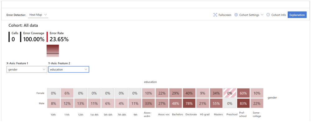
Figure 2 – While the overall error rate for the dataset is 23.65%, the heatmap reveals that the error rates are visibly higher, up to 83%, for individuals with higher education. Error rates are also higher for males vs. females.
Decision Tree for Error Identification
Very often, error patterns may be complex and involve more than one or two features. Therefore, it may be difficult for developers to explore all possible combinations of features to discover hidden data pockets with critical failure. To alleviate the burden, the binary tree visualization automatically partitions the benchmark data into interpretable subgroups, which have unexpectedly high or low error rates. In other words, the tree leverages the input features to maximally separate model error from success. For each node defining a data subgroup, users can investigate the following information:
- Error rate – a portion of instances in the node for which the model is incorrect. This is shown through the intensity of the red color.
- Error coverage – a portion of all errors that fall into the node. This is shown through the fill rate of the node.
- Data representation – number of instances in the node. This is shown through the thickness of the incoming edge to the node along with the actual total number of instances in the node.
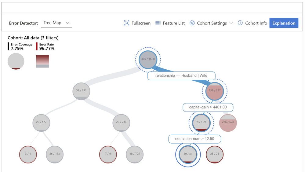
Figure 3 – Decision tree that aims at finding failure modes by separating error instances from success instances in the data. The hierarchical error pattern here shows that while the overall error rate is 23.65% for the dataset, it can be as high as 96.77% for individuals who are married, have a capital gain higher than 4401, and a number of education years higher than 12.
Cohort definition and manipulation
To specialize the analysis and allow for deep dives, both error identification views can be generated for any data cohort and not only for the whole benchmark. Cohorts are subgroups of data that the user may choose to save for later use if they wish to come back to those cohorts for future investigation. They can be defined and manipulated interactively either from the heatmap or the tree. They can also be carried over to the next diagnostical views on data exploration and model explanations.
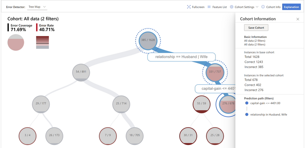
Figure 4 – Creating a new cohort for further investigation that focuses on individuals who are married and have capital gain lower than 4401.
2. Diagnosis
After identifying cohorts with higher error rates, Error Analysis enables debugging and exploring these cohorts further. It is then possible to gain deeper insights about the model or the data through data exploration and model interpretability.
Debugging the data
Data Explorer: Users can explore dataset statistics and distributions by selecting different features and estimators along the two axes of the data explorer. They can further compare the subgroup data stats with other subgroups or the overall benchmark data. This view can for instance uncover if certain cohorts are underrepresented or if their feature distribution is significantly different from the overall data, hinting therefore to the potential existence of outliers or unusual covariate shift.
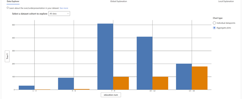
Figure 5 – In figure 1 and 2, we discovered that for individuals with a higher number of education years, the model has higher failure rates. When we look at how the data is distributed across the feature “education_num” we can see that a) there are fewer instances for individuals with more than 12 years of education, and b) for this cohort the distribution between lower income (blue) and higher income (orange) is very different than for other cohorts. In fact, for this cohort there exist more people who have an income higher than 50K, which is not true for the overall data.
Instance views: Beyond data statistics, sometimes it is useful to merely just observe the raw data along with labels in a tabular or tile form. Instance views provide this functionality and divide the instances into correct and incorrect tabs. By eyeballing the data, the developer can identify potential issues related to missing features or label noise.
Debugging the model
Model interpretability is a powerful means for extracting knowledge on how a model works. To extract this knowledge, Error Analysis relies on Microsoft’s InterpretML dashboard and library. The library is a prominent contribution in ML interpretability lead by Rich Caruana, Paul Koch, Harsha Nori, and Sam Jenkins.
Global explanations
Feature Importance: Users can explore the top K important features that impact the overall model predictions (a.k.a. global explanation) for a selected subgroup of data or cohort. They can also compare feature importance values for different cohorts side by side. The information on feature importance or the ordering is useful for understanding whether the model is leveraging features that are necessary for the prediction or whether it is relying on spurious correlations. By contrasting explanations that are specific to the cohort with those for the whole benchmark, it is possible to understand whether the model behaves differently or in an unusual way for the selected cohort.
Dependence Plot: Users can see the relationship between the values of the selected feature to its corresponding feature importance values. This shows them how values of the selected feature impact model prediction.
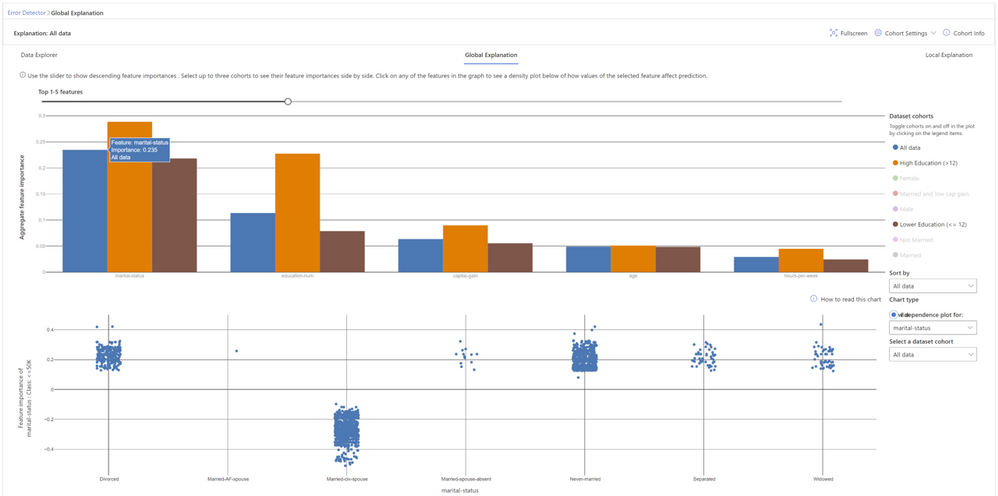
Figure 6 – Global feature explanations for the income prediction model show that marital status and number of education years are the most important features globally. By clicking on each feature, it is possible to observe more granular dependencies. For example, marital statuses like “divorced”, “never married”, “separated”, or “widowed” contribute to model predictions for lower income (<50K). Marital status of “civil spouse” instead contributes to model predictions for higher income (>50K).
Local explanations
Global explanations approximate the overall model behavior. For focusing the debugging process on a given data instance, users can select any individual data points (with correct or incorrect predictions) from the tabular instance view to explore their local feature importance values (local explanation) and individual conditional expectation (ICE) plots.
Local Feature Importance: Users can investigate the top K (configurable K) important features for an individual prediction. Helps illustrate the local behavior of the underlying model on a specific data point.
Individual Conditional Expectation (ICE): Users can investigate how changing a feature value from a minimum value to a maximum value impacts the prediction on the selected data instance.
Perturbation Exploration (what-if analysis): Users can apply changes to feature values of the selected data point and observe resulting changes to the prediction. They can save their hypothetical what-if data points for further comparisons with other what-if or original data points.
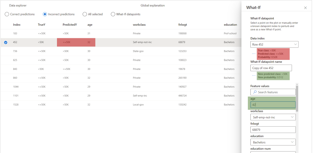
Figure 7 – For this individual, the model outputs a wrong prediction, predicting that the individual earns less than 50K, while the opposite is true. With what-if explanations, it is possible to understand how the model would behave if one of the feature values changes. For instance, here we can see that if the individual were 10 years older (age changed from 32 to 42) the model would have made a correct prediction. While in the real world many of these features are not mutable, this sensitivity analysis is intended to further support practitioners with model understanding capabilities.
Other relevant tools
Error Analysis enables practitioners to identify and diagnose error patterns. The integration with model interpretability techniques testifies to the joint power of providing such tools together as part of the same platform. We are actively working towards integrating further considerations into the model assessment experience such as fairness and inclusion (via FairLearn) as well as backward compatibility during updates (via BackwardCompatibilityML).
Our team
The initial work on error analysis started with research investigations on methodologies for in-depth understanding and explanation of Machine Learning failures. Besmira Nushi, Ece Kamar, and Eric Horvitz at Microsoft Research are leading these efforts and continue to innovate with new techniques for debugging ML models. In the past year, our team was extended via a collaboration with the RAI tooling team in the Azure Machine Learning group as well as the Analysis Platform team in Microsoft Mixed Reality. The Analysis Platform team has invested several years of engineering work in building internal infrastructure and now we are making these efforts available to the community as open source as part of the Azure Machine Learning ecosystem. The RAI tooling team consists of Ilya Matiach, Mehrnoosh Sameki, Roman Lutz, Richard Edgar, Hyemi Song, Minsoo Thigpen, and Anup Shirgaonkar. They are passionate about democratizing Responsible AI and have several years of experience in shipping such tools for the community with previous examples on FairLearn, InterpretML Dashboard etc. We also received generous help and expertise along the way from our partners at Microsoft Aether Committee and Microsoft Mixed Reality: Parham Mohadjer, Paul Koch, Xavier Fernandes, and Juan Lema. All marketing initiatives, including the presentation of this blog, were coordinated by Thuy Nguyen.
Big thanks to everyone who made this possible!
Related research
Towards Accountable AI: Hybrid Human-Machine Analyses for Characterizing System Failure. Besmira Nushi, Ece Kamar, Eric Horvitz; HCOMP 2018. pdf
Software Engineering for Machine Learning: A Case Study. Saleema Amershi, Andrew Begel, Christian Bird, Rob DeLine, Harald Gall, Ece Kamar, Nachiappan Nagappan, Besmira Nushi, Thomas Zimmermann; ICSE 2019. pdf
Updates in Human-AI Teams: Understanding and Addressing the Performance/Compatibility Tradeoff. Gagan Bansal, Besmira Nushi, Ece Kamar, Daniel S Weld, Walter S Lasecki, Eric Horvitz; AAAI 2019. pdf
An Empirical Analysis of Backward Compatibility in Machine Learning Systems. Megha Srivastava, Besmira Nushi, Ece Kamar, Shital Shah, Eric Horvitz; KDD 2020. pdf
Understanding Failures of Deep Networks via Robust Feature Extraction. Sahil Singla, Besmira Nushi, Shital Shah, Ece Kamar, Eric Horvitz. arXiv 2020. pdf





Recent Comments