This article is contributed. See the original author and article here.
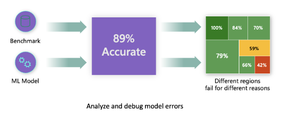
Traditional performance metrics for machine learning models focus on calculations based on correct vs incorrect predictions. The aggregated accuracy scores or average error loss show how good the model is, but do not reveal conditions causing model errors. While the overall performance metrics such as classification accuracy, precision, recall or MAE scores are good proxies to help you build trust with your model, they are insufficient in locating where in data the model has inaccuracies. Often, model errors are not distributed uniformly in your underlying dataset. For instance, if your model is 89% accurate, does that mean it is 89% fair as well?
Model fairness and model accuracy are not the same thing and must be considered. Unless you take a deep dive in the model error distribution, it would be challenging to discover the different regions of your data for where the model is failing 42% of the time (see the red region in diagram below). The consequence of having errors in certain data groups can lead to fairness or reliability issues. To illustrate, the data group with the high number of errors may contain sensitive features such as age, gender, disabilities, or ethnicity. Further analysis could reveal that the model has a high error rate with individuals with disabilities compared to ones without disabilities. So, it is essential to understand areas where the model is performing well or not, because the data regions where there are a high number of inaccuracies in your model may turn out to be an important data demographic you cannot afford to ignore.
This is where the error analysis component of Azure Machine Learning Responsible AI (RAI) dashboard helps in identifying a model’s error distribution across its test dataset. In the last tutorial, we created an RAI dashboard with a diabetes hospital readmission classification model we trained. In this tutorial, we are going to explore how data scientists and AI developers can use Error Analysis to identify the error distribution in the test records and discover where there is a high error rate from the model. In addition, we’ll learn how to create cohorts of data to investigate why a model is performing poorly in some cohorts and not others. Lastly, we will utilize the various methods available in the component for error identification: Tree map and Heat map.
Prerequisites
This is Part 4 of a tutorial series. You’ll need to complete the prior tutorial(s) below:
- Login or Signup for a FREE Azure account
- Clone the GitHub RAI-Diabetes-Hospital-Readmission-classification repository
- Part 1: Getting started with Azure Machine Learning Responsible AI components
- Part 2: How to train a machine learning model to be analyzed for issues with Responsible AI
- Part 3: How to create a Responsible AI dashboard to debug AI models
- NOTE: We’ll be using UCI’s Diabetes 130-US hospitals for years 1999–2008 dataset for this tutorial
How to interpret Error Analysis insights
Before we start our analysis, let’s first understand how to interpret the data provided by the Tree map. The RAI dashboard illustrates how model failure is distributed across various cohorts with a tree visualization. The root node displays the total number of incorrect predictions from a model and the total test dataset size. The nodes are groupings of data (aka cohorts) that are formed by splits from feature conditions (e.g., “Time_In_Hospital < 5” vs “Time_In_Hospital ≥ 5”). Hovering the mouse over each node on the tree reveals the following information for the selected feature condition:

- Incorrect vs Correct predictions: The number of incorrect vs correct predictions for the datapoints that fall in the node.
- Error Rate: represents the number of error occurrence in the node. The shade of red shows what percentage of this node’s datapoints are receiving erroneous predictions. The darker the red the higher the error rate.
- Error Coverage: represents how many of your model’s overall errors are happening in a given node. The fullness of the node shows the coverage of errors the node has. The fuller the node, the higher error coverage it has.
Identifying model errors from a Tree Map
Now let’s start our analysis. The tree map displays how model failure is distributed across various data cohorts. For our diabetes hospital readmission model, one of the first things we observe from the root node is that out of the 994 total test records, the error analysis component found 168 errors while evaluating the model.

The tree map provides visual indicators to make locating nodes or tree path with the error rate quicker. In the above diagram, you can see the tree path with the darkest red color has a leaf-node on the bottom right-hand side of the tree. To select the path leading up to the node, double-click on the leaf node. This highlights the path and displays the feature condition for each node in the path. Since this tree path contains nodes with the highest error rate, it is a good candidate to create a cohort with the data represented in the path in order to later perform analysis to diagnose the root cause behind the errors.

According to this tree path with the highest error rate, diabetes patients that have prior hospitalization and taking several medications between 11 and 22 are a cohort of patients where the model has the highest number of incorrect predictions. To investigate what’s causing the high error rate with this group of patients, we will create a cohort for these groups of patients.
Cohort # 1: Patients with number of Prior_Inpatient > 0 days and number of medications between 11 and 22
To save the selected path for further investigation. We can use the following steps:
- Click on the “Save as a new cohort” button on the upper right-hand side of the error analysis component. Note: The dashboard displays the “Filters” with the feature conditions in the path selection: num_medications 11.50, prior_inpatient > 0.00.
- We’ll name the cohort: “Err: Prior_Inpatient >0; Num_meds >11.50 & <= 21.50”.

As much as it’s advantageous in finding out why the model is performing poorly, it is equally important to figure out what’s causing our model to perform well. So, we’ll need to find the tree path with the least number of errors to gain insights as to why the model is performing better in this cohort vs others. The leaf node with the feature condition on the far left-hand side of the tree, is the path of the tree with the least errors.

The tree reveals that diabetic patients with no prior hospitalization, the number of other health conditions equal or less than 7, and the number of lab procedures equal or less than 57 are a cohort with the lowest model errors. To analyze the factors that are contributing to this cohort performing better than others, we’ll create a cohort for these group of patients.
Cohort # 2: Patients with number of Prior_Inpatient = 0 days and number of diagnoses ≤ 7 and number of lab procedures ≤ 57
For comparison, we will create a cohort of feature condition with the lowest error rate. To achieve this, complete the following steps:
- Double-click on the node to select the rest of the nodes in the tree path.
- Click on “Save as a new Cohort” button to save the selected path in a cohort. Note: The dashboard displays the “Filters” with the feature conditions in the path selection: num_lab_procedures <= 56.50, number_diagnoses <= 6.50, prior_inpatient <= 0.00.
- We’ll name the cohort: Prior_Inpatient = 0; num_diagnoses <= 6.50; lab_procedures <= 56.50
When we start investigating model inaccuracies, comparing the different features between top and bottom performing cohorts will be useful for improving our overall model quality (we’ll see this later in the next tutorial Part 5. Stay tuned).
Discovering model errors from the Feature list
One of the advantages of using the RAI dashboard to debug a model is that it provides the “Feature List” pane, which is a list of feature names in the test dataset that are error contributors (included in the creation of your error tree map). The list is sorted based on the contribution of the features to the errors. The higher a feature is on this list, the higher its contribution importance to your model errors. Note: Not to be confused with the “Feature Importance” section that will later be described in tutorial Part 7 (which explains what features have contributed the most to model predictions). This sorted list is vital to know the problematic features that are causing issues with the model’s performance. It is also an opportunity to check if sensitive features such as age, race, gender, political view, religion, etc. are among top error contributors. This is an indicator to examine if your model encounters potential fairness issues.

In our Diabetes Hospital Readmission model, the “Feature List” indicates the following features to be among the top contributors of the model’s errors:
- Age
- num_medications
- medicare
- time_in_hospital
- num_procedures
- insulin
- discharge_destination
Although, “Age” is a sensitive feature, we must check if there is a potential age bias with the model having a high inaccuracy with this feature. In addition, you may have noticed that not all the features on this list appeared on the Tree map nodes. The user can control how granular or high-level tree map should be displayed the error contributors, from the “Feature List” pane:
- Maximum depth: controls how tall the error tree should be. Meaning the maximum number of nodes that can be displayed from the root node to the leaf node (for any branch)
- Number of leaves: the total number of features with errors from the trained model. (e.g., 21 is the number of features highlighted on the bar to show the level of error contribution from the list)
- Minimum number of samples in one leaf: controls the threshold for the minimum number of data samples to create one leaf.
Try adjusting the control levels for the minimum number of samples in one leaf field to different values between 1 and 100 to see how the tree expands or shrinks. If you want to see a more granular breakdown of the errors in your dataset, you should reduce the level for the minimum number of samples in one leaf field.
Investigating Model Errors using the Heat map
The Heat map is another visualization functionality that enables users to investigate the error rate through filtering by one or two features to see where most of the errors are concentrated. This helps you determine which areas to drill down further so you can start forming hypotheses of where the errors are originating.
From the Feature List, we saw that “Age” was the top contributor of the model inaccuracies. So, we’re going to use the Heat map to see which cohorts within the “Age” feature are driving high model errors.

Under the Heat map tab, we’ll select “Age” in the “Rows: Feature 1” drop-down menu to see its influence in the model’s errors. The dashboard has a built-in intelligence to divide the feature into different cells with the possible data cohorts with the Age feature (e.g., “Over 60 years”, “30–60 years” and “30 years or younger”). By hovering over each cell, we can see the number of correct vs incorrect predictions, error coverage and error rate for the data group represented in the cell. Here we see:
- The cell with “Over 60 years” has 536 correct and 126 incorrect model predictions. The error coverage is 73.81%, and error rate 18.79%. This means that out of 168 total incorrect predictions that the model made from the test data, 126 of the incorrect predictions came from “Age==Over 60 years”.
- Even though the error rate of 18.79% is low, an error coverage of 73.81% is a huge number. That means a majority of the model’s inaccuracies come from data where patients are older than 60 years old. This is problematic.

- The cell with “30–60 years” has 273 correct and 25 incorrect model predictions. The error coverage is 25.60%, and error rate 13.61%. Even though, the patients with “Age==30–60 years” have a very low error rate, the error coverage of 25.60% is a quarter of all the model’s error, which is an issue.
- The cell with “30 years or younger” has 17 correct and 1 incorrect model predictions. The error coverage is 0.60%, and error rate 5.56%. Having 1 incorrect model prediction is insignificant. Plus, both the error coverage and error rate are low. It’s safe to say the model is performing very well in this cohort, however we must also consider that its total data size of 18 is a very small sample size.
Since our observation shows that Age plays a significant role in the model’s erroneous predictions, we are going to create cohorts for each age group for further analysis in the next tutorial.
Cohort #3: Patients with “Age == Over 60 years”
Similar to the Tree map, create a cohort from the Heat map by taking the following steps:
- Click on the “Over 60 years” cell. You’ll see a blue border around the square cell.
- Next, click on the “Save as a new cohort” button at the top right-hand corner of the Error Analysis section. A new pane will pop-up with a summary of new cohort, which includes error coverage, error rate, correct/incorrect prediction, total data size, and filters in the data feature.
- In the “Cohort name” box, enter “Age==Over 60 years”.
- Then click on the “Save” button to create the cohort.
- To deselect the cell, click on it again or click on the “Clear all” button.

Repeat the steps to create a cohort for each of the other two Age cells:
- Cohort #4: Patients with “Age == 30–30 years”
- Cohort #5: Patients with “Age <= 30 years”
If Age is playing a major role in why the model is performing poorly, we can conduct further analysis to better understand this cohort and evaluate if it has an impact in patient returning to the hospital within 30 days or not.
Managing cohorts
To view or manage all the cohorts you’ve created, click on the “Cohort Settings” gear icon on the upper right-hand corner of the Error Analysis section. In addition, the RAI dashboard creates a cohort called “All data” by default. This cohort contains all the test datasets used to evaluate the model.

Conclusion
As we have witnessed from using the Tree map, Feature List, and Heat map, the RAI dashboard provides multiple avenues of identifying features causing a model to be erroneous. Although, simply knowing which features are causing the error is not enough. It is beneficial for data scientists or AI developers to understand the number and magnitude of errors a feature has, when debugging a model. The dashboard helps in the process of elimination by pinpointing the error regions by providing the feature conditions to focus on as well as the number of correct/incorrect predictions, error coverage and error rates. This helps in measuring the influence the feature condition errors have on the overall model errors.
Discovering the correlation and dependencies between features helps in creating cohorts of data to investigate. Along with exploring the cohorts with the most errors, using the “Feature list” in conjunction with our investigations helps in understanding exactly which features are problematic. Since with found “Age” to be a top contributor on the “Feature List” and the Heat map also shows a high error coverage for diabetic patients that are Over 60 years in age, we can start forming a hypothesis that there may be an age bias with the model. We have to consider that given our use case; age plays a role in diabetic cases. Next, the Tree map enabled us to create data cohort where a model has high vs low inaccuracies. We found that diabetic patients with prior hospitalization were one of the features in the cohort with the highest error rate. On the other hand, patients with no prior hospitalization were one of the features in the cohort with the least error rate.
As a guide, use error analysis when you need to:
- Gain a deep understanding of how model failures are distributed across a dataset and across several input and feature dimensions.
- Break down the aggregate performance metrics to automatically discover erroneous cohorts in order to inform your targeted mitigation steps.
Awesome! Now…we’ll move on to the “Model Overview” section of the dashboard to start analyzing our cohorts and diagnosing issues with our model.
Stay tuned for Part 5 of the next tutorial…
Brought to you by Dr. Ware, Microsoft Office 365 Silver Partner, Charleston SC.

Recent Comments